Just something that tickled my mind for a moment. Looking up Final Fantasy 14, and compared to both Japan and Europe, our box art is rather simple and lame. (sorry if the images are large)
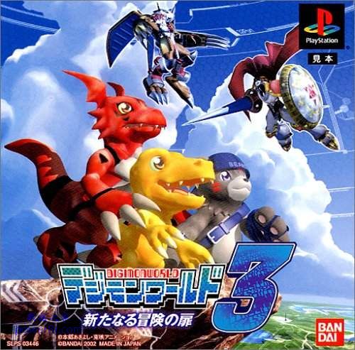
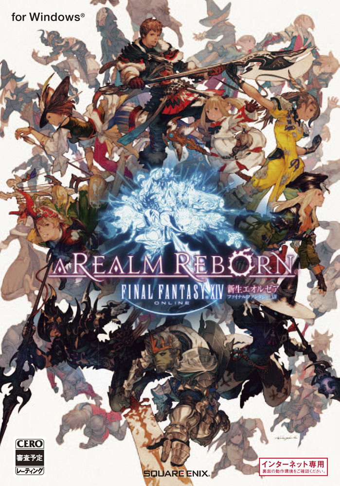
Japanese:
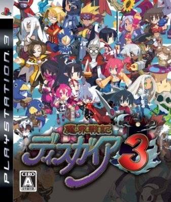
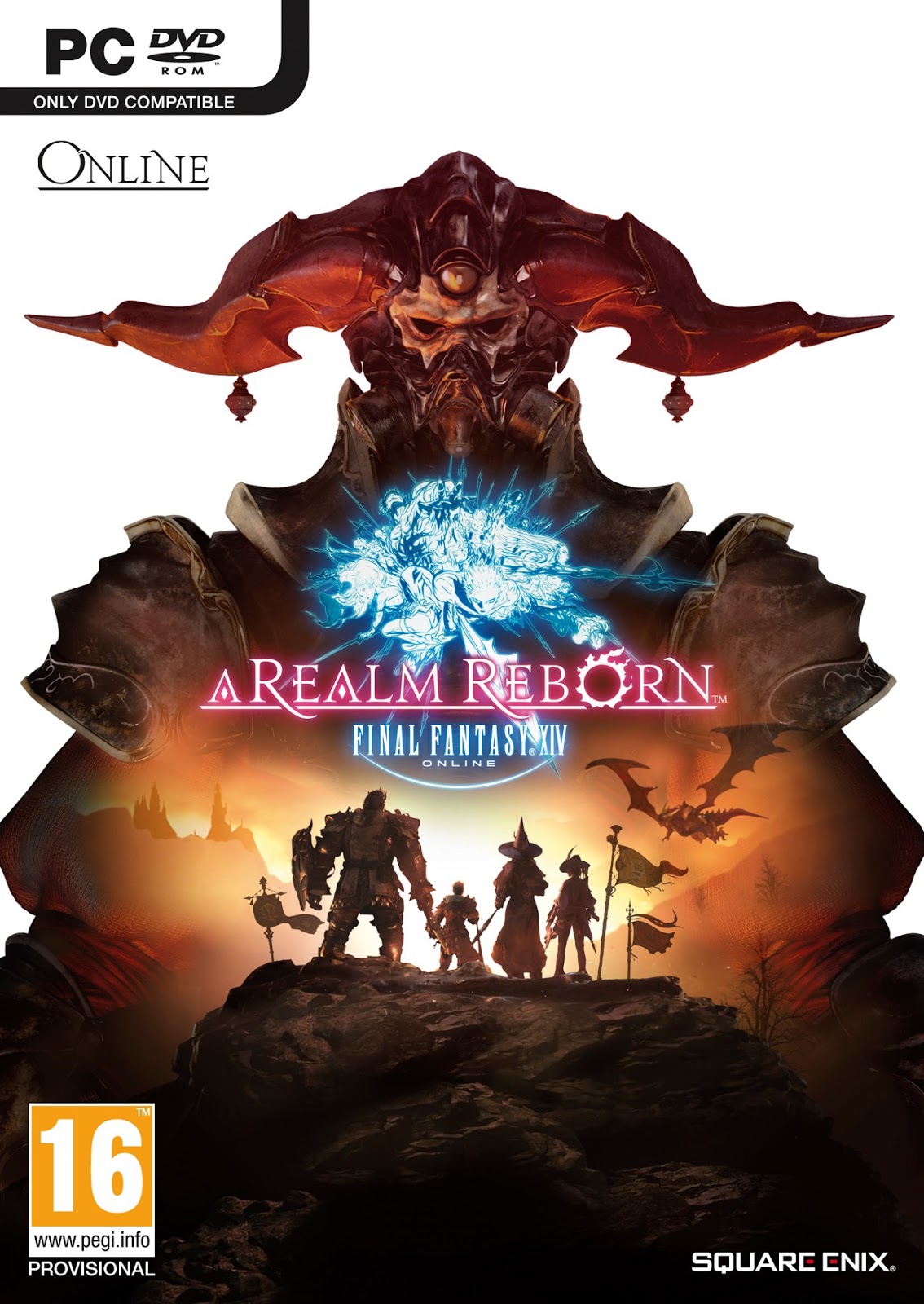
 Europe:
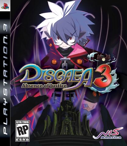
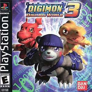
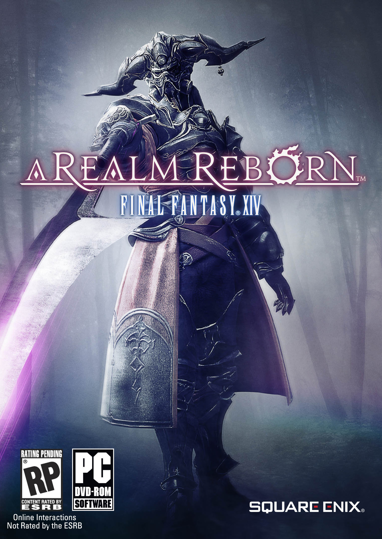
 And of course, America:
I just don't understand why we couldn't simply have either the Japanese box for the most part, or at least come up with something that feels a bit more artistic. Is there some marketing reason behind it all? Is the American public at large to a point where we need to shove poorly made art that often triest to tell the plot of the game or else they won't want to buy it? It's been pretty universal that American gamers often don't like the comparison. I'd dig up a few more examples but I'm lazy, and I'm sure many of you can recite by heart notible examples (Ico, Megaman, Amnesia dark Decent, Resident Evil 4 )
Has there ever been a time where the American box art sort of topped other countries? I can't think of any examples honestly. And not just art that actually was shared through all regions, times were America actually had the best. Yea I know the box doesn't matter, it's the game. but it's still sad to think there has to be a reason to the madness. I doubt Amnesia would have sold have as well if it was only sold via boxed copies with no help through steam.(it wouldn't have anyway, but I feel it would even be a fraction of that.)
Japanese:
I just don't understand why we couldn't simply have either the Japanese box for the most part, or at least come up with something that feels a bit more artistic. Is there some marketing reason behind it all? Is the American public at large to a point where we need to shove poorly made art that often triest to tell the plot of the game or else they won't want to buy it? It's been pretty universal that American gamers often don't like the comparison. I'd dig up a few more examples but I'm lazy, and I'm sure many of you can recite by heart notible examples (Ico, Megaman, Amnesia dark Decent, Resident Evil 4 )
Has there ever been a time where the American box art sort of topped other countries? I can't think of any examples honestly. And not just art that actually was shared through all regions, times were America actually had the best. Yea I know the box doesn't matter, it's the game. but it's still sad to think there has to be a reason to the madness. I doubt Amnesia would have sold have as well if it was only sold via boxed copies with no help through steam.(it wouldn't have anyway, but I feel it would even be a fraction of that.)