
A couple days ago I made a thread examining the box art of Infamous and Prototype.
http://www.escapistmagazine.com/forums/read/9.106188
While this was fun and all, but lets be honest, the box art of these games will have little impact on their sales. They'll both have big media advertising campaigns as well as extensive hype from websites like IGN. Also reviews and word of mouth will push sales. People rarely buy a 60 dollar game on impulse. But some games don't have any hype, or advertising. For these games all the marketing relies on the box. These games are sold for budget prices. For these games the box art matters. The games I'll be looking at are Wii titles I've never heard of that come out next week at budget prices. Your goal is to predict which will sell better based on the box art.
[img gravity]http://image.com.com/gamespot/images/bigboxshots/2/951202_108554_front.jpg[/img]
I like this box. It's got an attractive color scheme in the blues, reds and whites. The blue is especially eye popping. Everything is arranged in a nice playful way, and it's fairly obvious this is a puzzle game. There is a bit of unnecessary clutter; the gears in the blue background just serve to make the image less clean. And these objects have no personality. A ball, a ramp, some girder thingys? How is that supposed to make an impression on shoppers? And the name? Who is Hienz Wolff and why do we care? Is putting a professor name on it supposed to give it an air of intellectual legitimacy? And if that's so how come the good professor isn't represented anywhere on the cover? For those curious Wolff is apparently enough of a hotshot in Europe that the publishers thought his mug could sell the game there, but not in North America.
 [img museum]http://blogs.smithsonianmag.com/aroundthemall/files/2009/03/cover_escape_museum.jpg[/img]
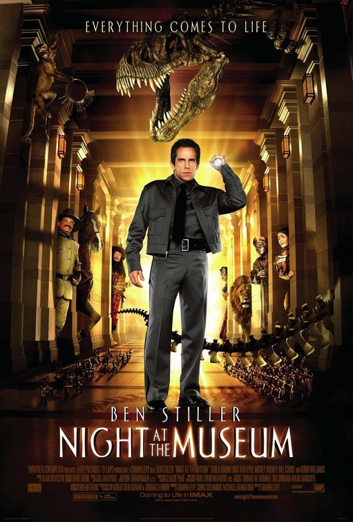
I have to give this box props for its honesty. Placing its worst feature plastered prominently on the front of the box. "Hidden Object Game" is an immediate cue, for most gamers to pass it over quickly. Luckily this game seems to be trying to sell to confused parents buying a game for their children who are fans of "Night at the Museum". The dinosaur skeleton is an iconic image for any natural history museum, but the dinosaur fails to pop as much as it should. The first thing your eye glances to is the garish Hidden Objects notice, not the dinosaur. Also, one can't help but get a low budget feel from this art, it relies to heavily on low contrast browns, and its mostly ugly.
 My prediction is for Gravity to win the sales awards here, despite the extra ten dollar price tag. Agree?
http://www.escapistmagazine.com/forums/read/9.106188
While this was fun and all, but lets be honest, the box art of these games will have little impact on their sales. They'll both have big media advertising campaigns as well as extensive hype from websites like IGN. Also reviews and word of mouth will push sales. People rarely buy a 60 dollar game on impulse. But some games don't have any hype, or advertising. For these games all the marketing relies on the box. These games are sold for budget prices. For these games the box art matters. The games I'll be looking at are Wii titles I've never heard of that come out next week at budget prices. Your goal is to predict which will sell better based on the box art.
[img gravity]http://image.com.com/gamespot/images/bigboxshots/2/951202_108554_front.jpg[/img]
I like this box. It's got an attractive color scheme in the blues, reds and whites. The blue is especially eye popping. Everything is arranged in a nice playful way, and it's fairly obvious this is a puzzle game. There is a bit of unnecessary clutter; the gears in the blue background just serve to make the image less clean. And these objects have no personality. A ball, a ramp, some girder thingys? How is that supposed to make an impression on shoppers? And the name? Who is Hienz Wolff and why do we care? Is putting a professor name on it supposed to give it an air of intellectual legitimacy? And if that's so how come the good professor isn't represented anywhere on the cover? For those curious Wolff is apparently enough of a hotshot in Europe that the publishers thought his mug could sell the game there, but not in North America.
I have to give this box props for its honesty. Placing its worst feature plastered prominently on the front of the box. "Hidden Object Game" is an immediate cue, for most gamers to pass it over quickly. Luckily this game seems to be trying to sell to confused parents buying a game for their children who are fans of "Night at the Museum". The dinosaur skeleton is an iconic image for any natural history museum, but the dinosaur fails to pop as much as it should. The first thing your eye glances to is the garish Hidden Objects notice, not the dinosaur. Also, one can't help but get a low budget feel from this art, it relies to heavily on low contrast browns, and its mostly ugly.