
Favourite box art
- Thread starter glitch388
- Start date
Recommended Videos

It embodies the isolated feeling of the game perfectly. The simplistic, yet haunting art design is an absolutely perfect fit.
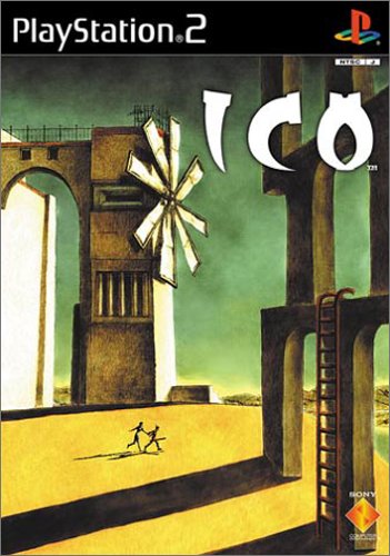
Woah. Ico. The blend of colors and absolutely stunning use of shadows ensures that all eyes are on Ico - and for a good reason. The faded colors give it a lonely, almost surreal look, when coupled with the abstract architecture, it culminates into something one of a kind.
Both covers try to instill a feeling of unfamiliarity within the onlooker, but they go about it different ways. Resident Evil chooses to establish an already familiar setting, in this case - a forest, and promptly drains it of all life, turning it into something haunting.
It's akin to a spooky hallway:

Relax, and feel free to lean in close. It's a .JPG, so nothing's going to jump at you. >_<
And you can't help but wonder, as you stare into that darkness at the very end, if something in the darkness is staring back at you.
Ico, on the other hand, starts off with an abstract design, but a much brighter color palette. It then chooses to add to the design, giving it robust shadows and eye-catching blends of colors, creating an area that, while not entirely familiar, is soothing and welcoming - a parallel to Resident Evil 4's dying woods.

I ran into that cover art at my local Gamestop once, but alas it was out of my price range.Aerodynamic said:
Would have loved to snag one of those. :S
To me its a cover that gets you interested in the game and lets you know what to expect without giving it all away.
Guilty Gear XX A Core + [http://www.abcgamesps2.net/loja/images/ggxxacp_wii_boxart_web_nbd.jpg]
And sometimes its all about looking awesome
Metroid Prime Trilogy [http://www.mywii.com.au/img/news/Metroid-Prime-Trilogy-Collections-Edition-Revealed--3.jpg]
Guilty Gear XX A Core + [http://www.abcgamesps2.net/loja/images/ggxxacp_wii_boxart_web_nbd.jpg]
And sometimes its all about looking awesome
Metroid Prime Trilogy [http://www.mywii.com.au/img/news/Metroid-Prime-Trilogy-Collections-Edition-Revealed--3.jpg]
Completely agreed - I loved the sleek design on the Metroid Trilogy's case.Gigaguy64 said:And sometimes its all about looking awesome
Metroid Prime Trilogy [http://www.mywii.com.au/img/news/Metroid-Prime-Trilogy-Collections-Edition-Revealed--3.jpg]
The special edition european box art for heavy rain.

Not only did it look awesome but it also had a rain texture on it.
Not only did it look awesome but it also had a rain texture on it.
Oh yea.Hazy said:Completely agreed - I loved the sleek design on the Metroid Trilogy's case.Gigaguy64 said:And sometimes its all about looking awesome
Metroid Prime Trilogy [http://www.mywii.com.au/img/news/Metroid-Prime-Trilogy-Collections-Edition-Revealed--3.jpg]
The way the positioned Samus on the cover and how her cannon is the center works really well.
And its always cool to have a Metal Game Case.
Pro Tip, Use the search bar, this has been done to death.
As for my favorite box art, Bioshocks cover looked pretty sweet, as did Unreal Tournament 3 Special edition.
As for my favorite box art, Bioshocks cover looked pretty sweet, as did Unreal Tournament 3 Special edition.
Shadow of The Colossus has gorgeous box art. I like the simplicity of the pre-XIII final Fantasy box art as well.
My Favorite is Kigndom Hearts 358/2 days. It just looks so awesome.
I also liked the Legend of Zelda Twilight Princess and Batman Arkham Asylum.
I also liked the Legend of Zelda Twilight Princess and Batman Arkham Asylum.
You mean the European ones with just the game logo on white background? Those were beautiful (the main reason why I bought the XIII Collector's Edition).Erja_Perttu said:Shadow of The Colossus has gorgeous box art. I like the simplicity of the pre-XIII final Fantasy box art as well.
My vote goes to Ico, though. Simplicity and beautiful use of colors.
It's a shame the PS3 wasn't able to get a Collector's Edition like the PC and 360.tjarne said:Bioshock with the rusty cover edition.
Would have loved some of those extras. >_<