Bad Box-Art for Otherwise Great Games

Recommended Videos

saintdane05

New member
Aug 2, 2011
1,849
0
0
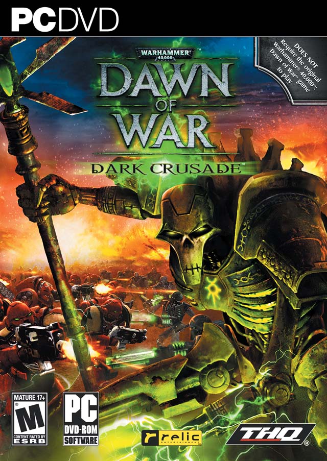
A game cover should give you a representation of what a game should be about?


That is the cover.

This is the game.
<youtube=bwp-zqW93BQ>


Yo, dog, I heard you like box art...

Twilight_guy said:

That.

I have no idea who thought this was a good idea for box art. Not even so long ago would this look like anything but a surreal nightmare.
Oh, you think that is bad? Try the European Megaman 2 box art!

<spoiler=It's bad>

The Tin Man fights Emperor Ming!
 

zehydra

New member
Oct 25, 2009
5,033
0
0
Twilight_guy said:

That.

I have no idea who thought this was a good idea for box art. Not even so long ago would this look like anything but a surreal nightmare.
It's like whoever they commissioned to make the boxart had never even seen or played the game.
 

shogunblade

New member
Apr 13, 2009
1,542
0
0
Can I vote my displeasure with the Atlus Marketing people for not making Catherine a reversible cover art choice without actually complaining about the box art?

I bought Catherine on PS3, which has a young blond girl with blue eyes staring at me, with the hero, Vincent, caught in her giant knockers. That's kind of silly to complain about, but I really loved the Catherine on 360, which has Vincent's girlfriend (Also Named Catherine), her glasses and silver-ish hair (It's anime, it makes it alright to have silver), staring up (well, sort of, she's winking) while her behind sits in the background (Not Really sitting, I suppose), with her boyfriend scaling his girlfriend's clothed bottom.

Yeah, I wanted it to work like the Ico/Shadow of the Colossus Collection box art: flip it over, and have another cover.

Also the original Half Life Box Art. Nothing about the game made me want to play it, but I'm playing it now, and it's actually kind of fun. I'm hoping that the face of Gordon Freeman staring at me for Half Life 2 (and his striking resemblance to both Hugh Laurie and Daniel Craig) will do me good once I beat the first game.
 

Glasgow

New member
Oct 17, 2011
193
0
0
BloatedGuppy said:
Always my submission when these threads come up. Hideous color palette, conveys absolutely nothing about the game thematically or in terms of narrative. Just a big blue head staring out from a garish orange backdrop.

.
That's a horrible cover for a great game. Such a shame...
 

Poetic Nova

Pulvis Et Umbra Sumus
Jan 24, 2012
1,974
0
0

Love this game to death (one of the best on PS2 imo). But damn the cover art just doesnt resemble the main character at all.
 
Oct 2, 2012
1,267
0
0
scorptatious said:
Point to the one you think is the worst box cover.


If you pick the right then you are correct!

I'll admit though, the American box cover is sort of nostalgic to me as I remember seeing it a lot at my local Hollywood Video store when I was little.
When I was a wee child of like 10 or 8 I remember passing by that game when looking for used games on the cheap. I passed on it because I thought the cover (and therefore the game) was very, very stupid. I was cursed with the crappy American version of the box art and to this day I wish that I somehow got a copy with the good European art on it. I would have picked it up and loved every second of it as I do now.
 

Vault101

I'm in your mind fuzz
Sep 26, 2010
18,863
15
43
GSP66 said:
It's just Adam Jensen with a gun and window shatter effect. I mean for a game with such deep themes as wealth disparity and the moral ambiguity regarding a mans (or womans) right to manipulate nature to further our evolution that's all they could come up with?
thats a alot to convey in boxart...plus wide apeal is more desireable than artictic integrity int his case (sad but true)
 

LobsterFeng

New member
Apr 10, 2011
1,766
0
0
jollybarracuda said:
LobsterFeng said:
I didn't really like Batman: Arkham Asylum's cover, but Arkham City's cover is pretty cool.
You know, the Arkham City cover actually really, really bothers me. The way the logo gets pushed off to the side like that makes it look like they got all excited with their sweet ass artwork, got it all printed out, and then remembered "oh...i think we forgot to put the logo on this" and ended up just sticking it off in the white space.

maybe im just overly concerned with box arts being balanced and centered.
Well I never really payed much attention to that before but now that's all I see. You're right, that is really annoying.
 

DustyDrB

Made of ticky tacky
Jan 19, 2010
8,365
3
43
BloatedGuppy said:
Always my submission when these threads come up. Hideous color palette, conveys absolutely nothing about the game thematically or in terms of narrative. Just a big blue head staring out from a garish orange backdrop.

Yeah, that's pretty terrible. Ever seen bootleg versions of DVD with "covers" that were obviously just made on some random dude's printer and shoved in the sleeve? Reminds me of that.
 

Shoggoth2588

New member
Aug 31, 2009
10,250
0
0
The Batman Arkham games have had pretty terrible box art. Aslyum, City, GOtY City and, Armored Edition range from bad to outright terrible. Especially GotY Edition Arkham City.

Also, Mass Effect 3 Wii U edition doesn't have the reversible cover.
 

Soviet Heavy

New member
Jan 22, 2010
12,218
0
0

CAN MY MOUTH GET ANY BIGGER!?

Just kinda boring.

I actually rather like this one, if it wasn't for the background being rather cheap looking.

Conventional.
 

Chester Rabbit

New member
Dec 7, 2011
1,004
0
0
RheynbowDash said:
Chester Rabbit said:
Mass Effect 3 - Let me have my opinions people.
I mean seriously they couldn't come up with anything better than the place holder Shepard giving a stern look with his new toy whipped out? ME1 we kind of had a Star wars movie poster cover. ME2, not great but still had at least some more of the cast on it; but this was just sooooo laaaame for the final epic chapter to this series.
I have to disagree, because Bioware was nice enough to give us the reversible cover so we didnt have to look at that generic 30-something, stubbled, white guy on the cover (I do enjoy the red-head FemShep ^_^)
Yeah I just meant the overall composition is really underwhelming and they should have gone with something more grandiose to illustrate the scope of the game. Something closer to the ME1 box art.
 

BathorysGraveland

New member
Dec 7, 2011
1,000
0
0
Risen 2: Dark Waters

]

It just looks ugly as fuck. I heard the US version required blue blood, because apparently this was too violent (???). Pretty good game though, all in all.
 

Ed130 The Vanguard

(Insert witty quote here)
Sep 10, 2008
3,782
0
0
GSP66 said:
Vault101 said:
GSP66 said:
Also Deus Ex Human Revolutions.
I thourght it was pretty good...set the tone and visual style
It's just Adam Jensen with a gun and window shatter effect. I mean for a game with such deep themes as wealth disparity and the moral ambiguity regarding a mans (or womans) right to manipulate nature to further our evolution that's all they could come up with?
Look closer at some of the panes of glass.
 

Warachia

New member
Aug 11, 2009
1,116
0
0
BloatedGuppy said:
Always my submission when these threads come up. Hideous color palette, conveys absolutely nothing about the game thematically or in terms of narrative. Just a big blue head staring out from a garish orange backdrop.

It did do a good job of illustrating the hideous colour palette in the game. Say what you want about the writing, no disagreement there, but the colours they picked certainly look like shit.
 

ASan83

New member
Mar 11, 2011
141
0
0
Twilight_guy said:

That.

I have no idea who thought this was a good idea for box art. Not even so long ago would this look like anything but a surreal nightmare.
This gets my vote. Also led to the first time I ever cussed in my life at seven years old. I was used to the box art style they used from MM3 onward, and when my friend showed me his copy, I looked at it, turned to him and said 'What the hell is this?"

Ah, memories...
 

BloatedGuppy

New member
Feb 3, 2010
9,572
0
0
RheynbowDash said:
I have to disagree, because Bioware was nice enough to give us the reversible cover so we didnt have to look at that generic 30-something, stubbled, white guy on the cover (I do enjoy the red-head FemShep ^_^)
I hate that Femshep. She looks 15. Shepard is a veteran military officer with years of experience even before the trilogy starts. This girl still has baby fat.

Imagine if the default Shepard had been female for years, and they finally did a contest for a "new look" Manshep, and settled on Taylor Lautner. Shepard is meant to be in his/her early 30's in ME3. Babyshep doesn't even have laugh lines.

Booo. Boooooooo.
 

Ziodyne64

New member
Jun 29, 2011
76
0
0
Wal-Mart...you suck. You ruined a great cover. I hate you, you moral dicks.

http://bulk.destructoid.com/ul/user/7/72860-200101-montagePNG-620x.jpg

The original Catherine box art was great. I really like how they had the PS3 Xbox 360 have different cover art. Then Wal-Mart had to ruin it by cropping the images...you guys suck.