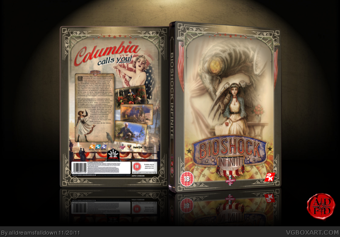
BioShock Infinite Gets a "Reversible Cover"

Recommended Videos

mateushac

New member
Apr 4, 2010
343
0
0
I am personally impressed with the lack of love for #2. It looks and feels so much like what I enjoyed from Bioshock (ie. it focuses on the subject of power and from there it delves into stuff like freedom and oppression).
For me 4 would come second as it lacks a little bit on the contrast department (the logo doesn't mix very well with the background) and doesn't do much to convey anything at all about the game.
6 would be acceptable, but it looks like it's just going for the emotional grab... so no...

I wouldn't even dare to comment on the rest.
 

DustyDrB

Made of ticky tacky
Jan 19, 2010
8,365
3
43
I like the second cover best, with the sixth being my next choice. Not a fan of all the red in four.

And guys, those of you complaining about the "bitching" and "butthurt" are the ones exaggerating things. Here's how things went: 1) People have noticed the trend of covers featuring angry dudes with guns. 2) BioShock Infinite's cover is unvealed, and it features an angry dude with a gun. 3) People noticed this and remarked on it. The strongest reaction I saw was mild annoyance.

There are different levels of complaining, people. Don't confuse people being a little annoyed with them thinking something is the worst, most evil thing ever.
 

pearcinator

New member
Apr 8, 2009
1,212
0
0
My mini-review on each...

1. Looks like a cartoon or some cover from the 90's - not really interesting.

2. Handyman is ugly.

3. They just put the chick on the front too? Well I 'spose it's still better than the original cos of eye-candy and less patriotism.

4. Meh the art is alright but I don't like the red...makes it seem too evil and hurts my eyes to look at it for too long.

5. A better version of 3...still the orange/blue contrast is distracting.

6. Probably the best although the background colours could be a bit less dull...more clouds and sky please!

My vote goes for #6 but I wouldn't mind #5
 

The Last Melon

New member
Mar 19, 2012
113
0
0
It restores my faith in humanity to see that number 4 and then number 6 are the top two in the vote as of right now.
 

Nicole Maronn

New member
Nov 22, 2012
24
0
0
I voted for Number 6. I love the artwork, reminds me of Norman Rockwell's covers for the Saturday Evening Post!
 

Baresark

New member
Dec 19, 2010
3,908
0
0
I feel like one of Pavlov's dogs. Whenever I see an article talking about anything that is Ken Levine related, I seem pre-programmed to do a certain action. It's not salivate though, my face twists into a contorted grimace and I get annoyed. This guy lobbies for so much attention it's mind blowing. He is giving Molyneux a run for his money at this point. My advice: Shut the fuck up and make games, idiot.
 

OManoghue

New member
Dec 12, 2008
438
0
0
It disturbs me that this was ever an issue. People need to sort out their God damned priorities.
 

Icehearted

New member
Jul 14, 2009
2,081
0
0
Nurb said:
Holy shit, Infinite is still a thing?
Silly wabbit! Rocks aren't for living under.

I dig the style on 6, it definitely feels more in synch with the vibe of the game.
 

Mrkillhappy

New member
Sep 18, 2012
265
0
0
I would have to say the 4 and 6 are the best two covers but I can't decide which one I like better.
 

DementedSheep

New member
Jan 8, 2010
2,654
0
0
Either number 4 or 6.
I?m leaning towards 6 because the logo of 4 looks out of place with the rest of the image. I'd be happy with #2 as well.
Number 1 is terrible, boring as hell and really out of proportion. I know it's stylized but that's just bad, I really hope that doesn't win (I doubt it will but you never know).
Number 3 is aright but boring.
5 is horrible and doesn't flow. It looks really obvious that it?s a bunch of separate images pasted together rather than one.

Edit:
I actually really like these (fan made?) covers that appeared in the thread about the main cover.

White_Lama said:
Why not one of these instead?
Then again, hopefully with being European, I won't have to look at that cover.


Dfskelleton

New member
Apr 6, 2010
2,851
0
0
The original cover art actually didn't bother me too much, but the fact that they were willing to do this reversible-cover upon hearing the complaints of their fans is a testament to how awesome the guys at Irrational are.

#4 or #6 will probably get my vote, althoug #2 does look pretty awesome...
 

Ed130 The Vanguard

(Insert witty quote here)
Sep 10, 2008
3,782
0
0
The current poll is:

Design 4
40%

Design 6
29%

Design 5
12%

Design 3
8%

Design 2
6%

Design 1
5%

And people say that whining on the internet does nothing.

Seriously props to Irrational for listening and doing this.
 

CAPTCHA

Mushroom Camper
Sep 30, 2009
1,075
0
0
I'm not to keen on any of them really.

1: It's a pin up gal, with bad proportions.

2: Not a fan of the creature design for the Handymen and the whole thing screams repurposed concept art with the logo plastered on in photoshop.

3:Same as origional cover, but with both characters - better than origional for that, but not really worth making an alternative option.

4: Nice pic. Reminds me of the Japanesse FFVI cover. However the art style is so alien to the game design. Nothing about this picture reminds me of Bioshock.

5: Same issue as three, but with the girl in the fore. The colour choice is a bit meh however and it makes no reference to the game world. It's the sort of cover I would expect from a film with high profile actors who are counting on recognition to sell. Doesn't really work for a game though.

6: Probably my favorite of the bunch, but it's doesn't really 'wow' me a great deal.

Order of preference: 6, 3, Original, 5, 4, 2, 1.