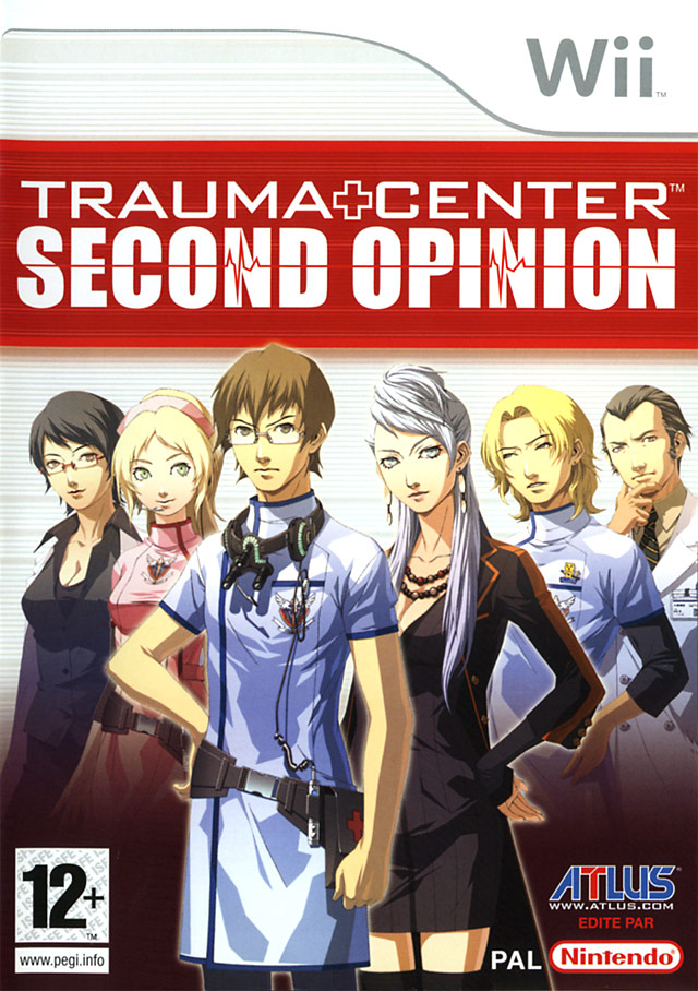
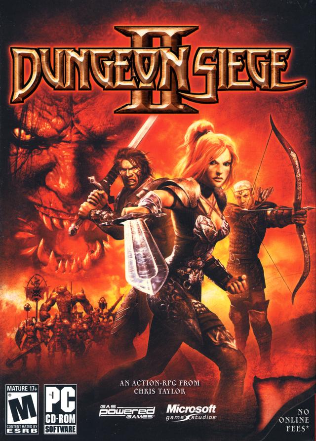
I'm of the school that says it is better to have too little than too much in a cover.BishopofAges said:I do agree with your choices for the redo of the cover art, except for 1, 1 seems a bit sparse, I liked 4, 5,and 6 in no particular order just because of the content is very telling. If 1 was the first cover with the title and everything on it, one wouldn't know what the game is about really at first look.
For example:


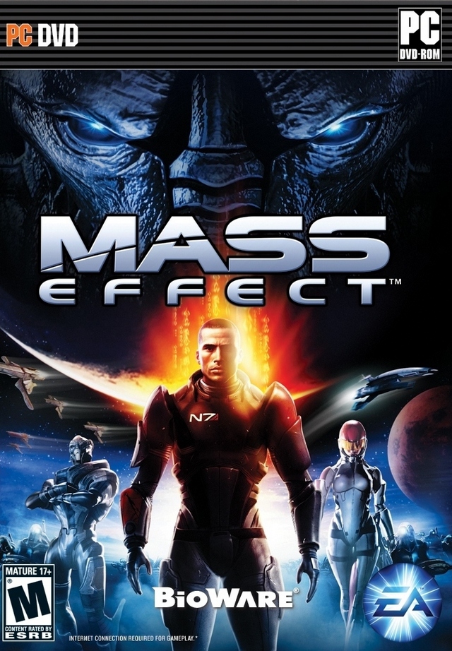


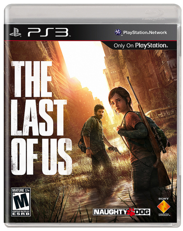
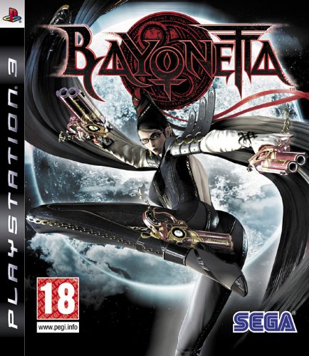


.jpg)
