Google's new logo: Good, bad, or ugly?

Recommended Videos

FPLOON

Your #1 Source for the Dino Porn
Jul 10, 2013
12,531
0
0
Scarim Coral said:


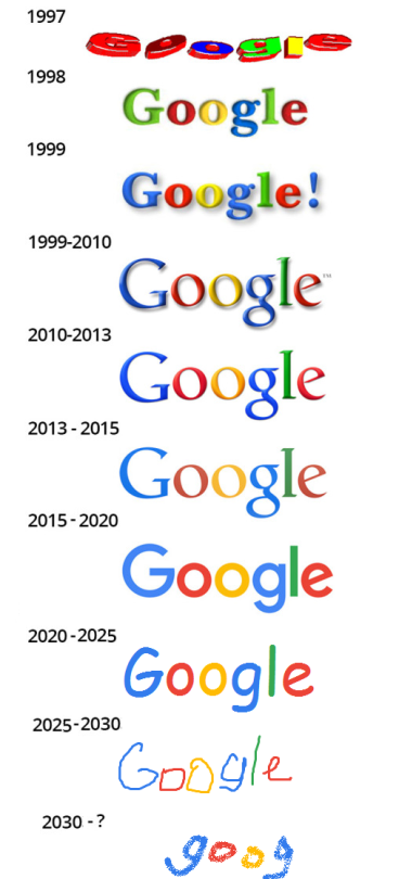
Man the very first logo remind me of the 56k era and those safari(?) website layout sellers (the ones that everybody used when making their own fan sites).
...Now, I somehow miss the late-90s Google logos for some reason...

OT: Wait... you mean this truly is the new logo? What the fuck did they do with the "g"? Dammit, why can't I choose which logo I want to see on my google search screen the same way I have [REDACTED] and [REDACTED] as my search engine background? Custromization, yo!

Other than that, now I'm going to be waiting for it to turn itself into a "snake" and start reenacting the mobile game version of Snake when "you're not looking"...
 

FalloutJack

Bah weep grah nah neep ninny bom
Nov 20, 2008
15,489
0
0
Google reminds me that "DALEKS HAVE NO CONCEPT OF ELEGANCE". I vote 'The Ugly'.
 

Glexn

New member
Feb 11, 2011
12
0
0
The icon, blue and green should never be seen unless there's something in between.

The logo looks like it was drawn with crayons.
 

vallorn

Tunnel Open, Communication Open.
Nov 18, 2009
2,309
1
43
It's certainly not the worst logo I've ever seen.


For those who don't know, that's the official London 2012 Olympics logo... It's a monstrosity.

There's also this logo for a sushi restaurant what's supposed to be a rising sun behind a japanese tea house... Yeah... It doesn't look like that I know:

But still. Taken on it's own... It's just... bland. I guess it fits with Google's downward trend from a technologist headed company to just another corporation with faceless, emotionless sociopaths running the board of directors. So good on them for that? But, yeah, it's somehow both bland, annoying and slightly straining on the eys with it's shapes and pastelish shades.

And good god the
is AWFUL.
 

Rattja

New member
Dec 4, 2012
452
0
0
Liked the old one better, but it does not really bother me that much no matter what they do to it to be honest. Also it changes every time there is some kind of event (which is quite often) so meh..

What does bother me however is that someone out there somewhere probably got payed for making this thing and changing it.
 

Neurotic Void Melody

Bound to escape
Legacy
Jul 15, 2013
4,953
6
13
Nonono, what terrible blandness is happening to thine eyes?? Make it stop! Ooglies or GTFO...


Tayh

New member
Apr 6, 2009
775
0
0
I'm not too impressed, either. It just looks flat and generic.
At least the old one looked like it had some depth.
 

Major_Tom

Anticitizen
Jun 29, 2008
799
0
0
I don't really care, but the tiny browser tab icon is different and that's fucking with me.
 

bluegate

Elite Member
Legacy
Dec 28, 2010
2,424
1,033
118
Goes nicely with how they are designing their products for the past year and a half ( material design and such ), so yes, I like it.
 

Vicarious Reality

New member
Jul 10, 2011
1,398
0
0
Worgen said:
I don't like this weird flatness thing that everyone is going for now. Window's has been doing that lately too. Just this weird flat thing.
yup, ultra minimalistic rectangular design with boring pastel colors sure is futuristic


Drathnoxis

I love the smell of card games in the morning
Legacy
Sep 23, 2010
6,023
2,235
118
Just off-screen
Country
Canada
Gender
Male
Uhh, is it different? I mean, the letters are all the same colours and it still just says Google, what are we supposed to be critiquing, the font?

The bigger change in my opinion was the change of the little icon that displays on tabs from:

To:


I don't really care since I barely use Google since they started their campaign to pester me into setting Google as my default homepage/search engine even though Google was already my default homepage/search engine.
Keeps making me wonder what webpage I have open for a second.