
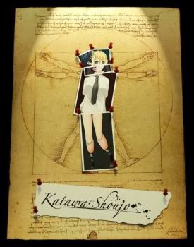
Katawa Shoujo fan box art
- Thread starter DrRockor
- Start date
Recommended Videos

That's some fantastic work right there. Still, Lilly could use more text, and Rin's picture is a bit too small.
I was having trouble thinking of a good picture for Rin, I might change it to the one where she's stood on the hill. It's hard to sum up Lilly in a couple of words.Breaker deGodot said:That's some fantastic work right there. Still, Lilly could use more text, and Rin's picture is a bit too small.
I need to rearrange some it to fit that stuff in. By the time I got the last picture in I was almost outboag said:The back drop requires additional information about the game and whatever copyrights or creative commons licenses are used, credits for the Development team and a brief overview.
Other than that nice work.
It is the pegi rating symbol for sexual contentForgottenPr0digy said:what's with the gender symbols on the back of the box?
No! NO!
Not Games for Windows Live! NOOOOOOOOOOO!
Also considering you don't find out about Emi's accident for a while... spoilers maybe?
but I think overall it could do with being lighter. Lose the black, put in one of the backgrounds from the game, something neutral.
Not Games for Windows Live! NOOOOOOOOOOO!
Also considering you don't find out about Emi's accident for a while... spoilers maybe?
but I think overall it could do with being lighter. Lose the black, put in one of the backgrounds from the game, something neutral.
It just says "Games for Windows" not "Windows Live"Loop Stricken said:No! NO!
Not Games for Windows Live! NOOOOOOOOOOO!
") That's how PC games are labeled (at least here in the US, and likely where OP lives).
That's how PC games are labeled (at least here in the US, and likely where OP lives).I love the cover of the game. It is so cute. For the back though, to save up space and include more information a basic summary of the game might help best instead of the character profiles. Maybe another group picture in a different area would show all the girls. Maybe a neutral color would work best as well to make the words stand out better...
The current back now looks like it would be best in the game manual inside the box.
Now if we could use this for marketing...you would need...actually, let me stop right now unless that idea would lead to a higher grade..
The current back now looks like it would be best in the game manual inside the box.
Now if we could use this for marketing...you would need...actually, let me stop right now unless that idea would lead to a higher grade..
No up-skirt, no pantie shots, and no big boob shots... how dare you desecrate the anime name, go to your room and do it again!
I don't like the fact that you focused on the disabilities on the back.
I think the blurb should be more about the story and Hisao and just mention that he will encounter some life-changing people or something like that.
Also, the front is kind of bland and uninspired.
Have you seen the one on vndb?
You should try something a bit more different and stylish.
I think the blurb should be more about the story and Hisao and just mention that he will encounter some life-changing people or something like that.
Also, the front is kind of bland and uninspired.
Have you seen the one on vndb?
You should try something a bit more different and stylish.
It just says "Games For Windows", not GFWL. There are many, many games that don't use GFWL that use the label of Games For Windows.Loop Stricken said:No! NO!
Not Games for Windows Live! NOOOOOOOOOOO!
OT: The front label looks pretty nice... but the back label... I don't know, it needs something else instead of just a black backdrop with some photos. The photos are fine, but it needs something more, as it is, it looks kinda empty. But other than that, it's a great job you've done there.
Prety much this.Mr.K. said:No up-skirt, no pantie shots, and no big boob shots... how dare you desecrate the anime name, go to your room and do it again!
I'm with everyone who says the back looks a little off btw - and the captions are a mixture of too much information and too little. The front looks fine for a generic game box.
Why would everyone ridicule OP?Monicro said:why is everyone not ridiculing you for this
I honestly don't understand why.
OT: Whatever, the back needs to not be black, it's too stark, it looks amateur/unprofessional.
Otherwise it's pretty good. The spoilers on the back might need to be toned back.
it looks nice but I always imagined VN,s being sold in jewel cases (you know the type they also sell music CD,s in) the back looks a bit bland with just the black background but overall it looks really nice