Not fond of it, especially since I exclusively play as FemShep because I can't stand MaleShep's voice. Could use other characters or make him not look so pissed off. Just because he's saving the world doesn't mean he has to be all "GRRR, I'M COMMANDER SHEPARD, GRRR."

Mass Effect 3 Cover Art - Improvement?
- Thread starter Steampunk Viking
- Start date
Recommended Videos
If I were to play the game fir fifty hours, that would be three seconds if my time spent looking at the cover to find out which game is ME3. So.....it doesn't matter. I griped for a bit when Microsoft changed the dashoard, but then I realised I spent all of thirty seconds looking at it before I spent the rest of the time playing the game.
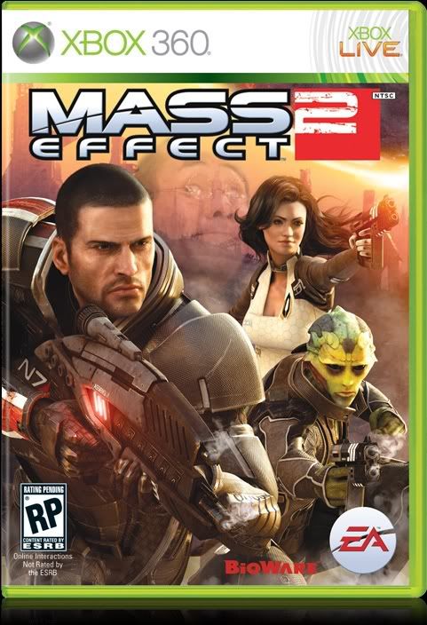
It's definitely an improvement over ME2's box art, though that's not saying much. Honestly, I find it to be very bland and generic, and it emphasizes all the wrong qualities for a Mass Effect game.
Just look at the first game's box art [http://upload.wikimedia.org/wikipedia/en/thumb/d/d9/Mass_Effect_poster.jpg/256px-Mass_Effect_poster.jpg]; it's undeniably simplistic and, at a glance, seems kinda boring. Nonetheless, it perfectly represents what the game is going to be like; from this image alone, we can gather an emphasis on teamwork, character building, player choice, galaxy exploration, hints of a looming threat and sprawling science-fiction lore, all weaved within a shiny "space opera" aesthetic.
Now look at Mass Effect 3's box art [http://upload.wikimedia.org/wikipedia/en/3/3a/ME3cover.jpg]. All we can gather from this cover is that A) a planet is being invaded, and B) one person is in it. It's the kinda style that we see all [http://upload.wikimedia.org/wikipedia/en/7/73/TimeShift_coverart.jpg] the [http://upload.wikimedia.org/wikipedia/en/thumb/2/21/Resistance_2_cover_art.png/250px-Resistance_2_cover_art.png] bloody [http://upload.wikimedia.org/wikipedia/en/thumb/e/e1/Gow2_offbox.jpg/256px-Gow2_offbox.jpg] time [http://upload.wikimedia.org/wikipedia/en/thumb/b/b4/Halo_3_final_boxshot.JPG/250px-Halo_3_final_boxshot.JPG] in shooters. However, those games are meant to set their focuses on large-scale disasters and the "lone-wolf" protagonists that have to fix them; in other words, the box art for ME3 reflects about 10% of what the game is going to offer.
So yeah, I don't really like this game's box art either, though it I guess it ultimately doesn't matter too much. ME3 will probably still be a decent game; besides, there have been greater games with even more hideous box art [http://upload.wikimedia.org/wikipedia/en/2/2b/Ico_north_american_cover.jpg].
To be honest, that was a problem with Bioware's earlier games too.Zhukov said:You might want to change that to "cover art". People are going to think you are talking about the gameplay cover system.
Anyway...
ME1's cover was poorly designed, mediocre at best. Overly crowded. Looked like the result of a graphic design student's first photoshop assignment.
ME2's cover was, yeah...crap. Ohh look, people with guns. Boring and generic with bad composition to boot.
ME3's cover is at least a little better composed, but is still crap. Ohh look, a soldier guy.


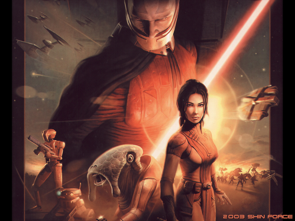
The Star Wars one gets a pass from me though, because it is emulating the movie posters that were made during the prequels.
I like the contrast of on the left Half of Shepard, that part of Earth is destroyed, but on the right path its currently not been hit. Even if unintentional it adds a little bit of 'You can pick which one' to the image, but it really isn't great. The whole 'One soldier' thing is exactly what the ME franchise Should NOT be about, and the whole fact it tries to make itself look like the other military shooter covers is just disturbing.
The planet that morphs into Saren's face is barely noticeable, but I'll agree it didn't really need to be there - they were likely just looking for a way to effectively transition from Shepard to Saren.
Garrus and Ashley are smaller and off to the side, and the Geth and starships are even less prominent.
That small planet off to the side is kind of a 'Why?' thing that I feel would have been better done with a background nebula that blended in with the space background at that point (The space background could even have been shown instead of the big planet, still give Saren's face a place, whilst also making it look more ominous IMO.
Overall, its like a more spaced out version of many Starwars covers. You've got your planet, your ships, your main role, your supporting cast, the big ominous villain in the background, but here its all spread out to fill the cover as opposed to all stuck in the middle. IDK if it would have looked better all cramped into the middle, I personally don't think it would have, and I will admit that those planets are just useless, but the rest of it somewhat works.
I find its also about what the cover is trying to communicate. It shows you Saren - and establishes he is the villain. It shows you Shepard and establishes him as the Protagonist. We can tell Shepard will have allies on his journey, as they are beside him and also prominent. We can tell that those Geth are the enemy - due to their positioning behind Shepard and his team and the lower level of importance on them (IMO, they should have made them look aggressive instead of passive). We can tell space travel to different planets will be a part of it - thanks to the planets and starships in the background. It communicates a fair bit of the game to us with what it shows. Admittedly, some things could have been removed, slightly edited or rearranged a bit, but I'll agree with the guy you quoted that it is your classic Space Opera front Cover.
Edit: Note the covers posted above me have the top half of the image cut out. I have the box infront of me ATM, and there is another half to the ME cover at least that contains the Mass Effect Title, and above it Saren's face.
There is a clear Focal Point: Shepard right in the middle with the glow of what we know is Vigil, but before hand could've just looked like a nice effect, behind him. You do have Saren right up on top as very big, but he was arguably as important as Shepard in the game, and the focus on him gives the player that ominous foreboding of who is he, and what is he doing?Zhukov said:Too crowded. It's like they wanted to fit every single thing on there. Default Shepard, Garrus, Ashley, Saren, Vigil, bunch o' Geth, Normandy, Sovereign, random ships, two planets. Too much.
Plus, the composition is bad. Rather than looking like one image, it looks like the photoshoped bastard-child of about ten different images.
The best visual designs are simple and striking with a clear focal point. ME1's cover is the exact opposite.
The planet that morphs into Saren's face is barely noticeable, but I'll agree it didn't really need to be there - they were likely just looking for a way to effectively transition from Shepard to Saren.
Garrus and Ashley are smaller and off to the side, and the Geth and starships are even less prominent.
That small planet off to the side is kind of a 'Why?' thing that I feel would have been better done with a background nebula that blended in with the space background at that point (The space background could even have been shown instead of the big planet, still give Saren's face a place, whilst also making it look more ominous IMO.
Overall, its like a more spaced out version of many Starwars covers. You've got your planet, your ships, your main role, your supporting cast, the big ominous villain in the background, but here its all spread out to fill the cover as opposed to all stuck in the middle. IDK if it would have looked better all cramped into the middle, I personally don't think it would have, and I will admit that those planets are just useless, but the rest of it somewhat works.
I find its also about what the cover is trying to communicate. It shows you Saren - and establishes he is the villain. It shows you Shepard and establishes him as the Protagonist. We can tell Shepard will have allies on his journey, as they are beside him and also prominent. We can tell that those Geth are the enemy - due to their positioning behind Shepard and his team and the lower level of importance on them (IMO, they should have made them look aggressive instead of passive). We can tell space travel to different planets will be a part of it - thanks to the planets and starships in the background. It communicates a fair bit of the game to us with what it shows. Admittedly, some things could have been removed, slightly edited or rearranged a bit, but I'll agree with the guy you quoted that it is your classic Space Opera front Cover.
Edit: Note the covers posted above me have the top half of the image cut out. I have the box infront of me ATM, and there is another half to the ME cover at least that contains the Mass Effect Title, and above it Saren's face.
You have just described everything that is wrong with that cover from a visual design perspective. There is too much crap stuffed onto a small surface. Hell, just the fact that it took you three paragraphs to describe it demonstrates my point.Joccaren said:[The great snip of our time]Zhukov said:[Critique of ME1 cover art]
You're right about the focal point. Problem is, it's surrounded by a ton of extraneous crap. Also, that 'spaced out' quality you mentioned? That's also a problem. It makes the various elements look like they were taken from different images and stuck onto the cover rather than being drawn as one cohesive image.
Like I said, the best visual designs are simple and striking. A better cover would have just had Vigil, or just had the Normandy rather then trying to fit in as much as they possibly could.
...
I have a better idea. They say a picture is worth a thousand words, so here's a picture for you:
This is the cover art for the collector's edition of ME2.

Now, are you really going to try and tell me that ME1's cover is better than that?
thats pretty nice its a shame they didnt have that as the standard...Zhukov said:You have just described everything that is wrong with that cover from a visual design perspective. There is too much crap stuffed onto a small surface. Hell, just the fact that it took you three paragraphs to describe it demonstrates my point.Joccaren said:[The great snip of our time]Zhukov said:[Critique of ME1 cover art]
You're right about the focal point. Problem is, it's surrounded by a ton of extraneous crap. Also, that 'spaced out' quality you mentioned? That's also a problem. It makes the various elements look like they were taken from different images and stuck onto the cover rather than being drawn as one cohesive image.
Like I said, the best visual designs are simple and striking. A better cover would have just had Vigil, or just had the Normandy rather then trying to fit in as much as they possibly could.
...
I have a better idea. They say a picture is worth a thousand words, so here's a picture for you:
Simple. Striking. Focal point.This is the cover art for the collector's edition of ME2.
Now, are you really going to try and tell me that ME1's cover is better than that?
though I do notice I tend to judge thease things in terms "would I put it on my wall?" which I know seems to be a catchprase applyed to dumb people who dont get art..
Id put ME boxart on my wall if it was in poster form reason is I didnt mention before, but I think the original ME boxart is very much like those oldschool starwars/sci fi movie posters...perhaps that was what they were going for
PLEEEEEEEEASE Tell me there's an alternate version with Femshep! Her character design is sooooo much better than his...lacktheknack said:Here it is to anyone who hasn't seen it.
<img width=300>http://images.wikia.com/masseffect/images/b/be/ME3_Cover_Art.png
Still not as good as the first Mass Effect, but better than Mass Effect 2.
Not that I can find, sorry...Gmans uncle said:PLEEEEEEEEASE Tell me there's an alternate version with Femshep! Her character design is sooooo much better than his...lacktheknack said:Here it is to anyone who hasn't seen it.
<img width=300>http://images.wikia.com/masseffect/images/b/be/ME3_Cover_Art.png
Still not as good as the first Mass Effect, but better than Mass Effect 2.
Wait I can fix this! I got you covered bro.Zachary Amaranth said:Looks bland to me, but it doesn't matter. Short of having a sticker that says "Made by Hitler," I can't imagine a cover impacting my purchase.lacktheknack said:Here it is to anyone who hasn't seen it.
<img width=300>http://images.wikia.com/masseffect/images/b/be/ME3_Cover_Art.png
Still not as good as the first Mass Effect, but better than Mass Effect 2.

The collectors edition features Femshep on one side and Male Shepard on the other, I believelacktheknack said:Not that I can find, sorry...Gmans uncle said:PLEEEEEEEEASE Tell me there's an alternate version with Femshep! Her character design is sooooo much better than his...lacktheknack said:Here it is to anyone who hasn't seen it.
<img width=300>http://images.wikia.com/masseffect/images/b/be/ME3_Cover_Art.png
Still not as good as the first Mass Effect, but better than Mass Effect 2.
I'm pretty sure I heard that she's going to be on the reverse side of the box in at least one of the editions.Gmans uncle said:PLEEEEEEEEASE Tell me there's an alternate version with Femshep! Her character design is sooooo much better than his...lacktheknack said:Here it is to anyone who hasn't seen it.
<img width=300>http://images.wikia.com/masseffect/images/b/be/ME3_Cover_Art.png
Still not as good as the first Mass Effect, but better than Mass Effect 2.
Well, a side by side comparison may be in order.


I am a massive fanboy of the series, but in my opinion, the first game's cover is not very good at all. Decent, but way too cluttered. The second game's cover is absolutely terrible and generic, but who cares, we finally got to play Commander Shepard again! But the third game's cover actually looks alright (once again not great, but better than the others). It has much of the same effect as the first cover without the awkwardness and crowding.
But, all in all, I'm not totally certain why we're having this discussion. The fans would buy it even if the cover just had a jellyfish on it[1], so in the end it doesn't really matter.
[1] Just to be clear, not the image of a jellyfish, a life one.
That stings.
Too an extent yes, and to an extent no.Zhukov said:You have just described everything that is wrong with that cover from a visual design perspective. There is too much crap stuffed onto a small surface. Hell, just the fact that it took you three paragraphs to describe it demonstrates my point.
You're right about the focal point. Problem is, it's surrounded by a ton of extraneous crap. Also, that 'spaced out' quality you mentioned? That's also a problem. It makes the various elements look like they were taken from different images and stuck onto the cover rather than being drawn as one cohesive image.
Like I said, the best visual designs are simple and striking. A better cover would have just had Vigil, or just had the Normandy rather then trying to fit in as much as they possibly could.
...
I have a better idea. They say a picture is worth a thousand words, so here's a picture for you:
Simple. Striking. Focal point.This is the cover art for the collector's edition of ME2.
Now, are you really going to try and tell me that ME1's cover is better than that?
The cover art of the ME2 Collectors edition is more streamlined, has better definition and is looks more visually appealing. The massive downside? It tells us NOTHING about the game. NOTHING at all. Reading stupidly into it I could say that it tells us about Shepard's N7, and the liquid on it is rain from Pragia, which suits to tell us that we will be going to a wet planet and that the rain also symbolises tears for the loss of Shepard at the start of the game, and his loss of his love to other circumstances. That, however, is using knowledge not available if you had never heard of the game before, and adding in info that the cover artists probably didn't even think of.
Mass Effect 1's cover, whilst not as streamlined or visually appealing, tells us about the game - something I'd argue is just as important for a cover to do. Otherwise, there is little point to the cover. You might as well put the Mona Lisa on it for all the good it does. A good cover art should not only be visually appealing, but should also tell us something about the game. This will usually come in the form of details. If you've ever read the 'Keys to the Kingdom' books, I'd suggest a good coverart be that gate thing with the infinite detail. You could change it each book, and whilst it would have that gate as a key focal point and the only thing on it, you could include in the gate's design a hint at what will go on in the book. As a whole, you can look at the gate as one object. Look at the details, and its a different story.
That is the main problem with ME2 CE cover: It tells us nothing. Being the collectors edition, it works as the audience for it will know the game. If I were to see that in a store, however, I would walk past it as it told me nothing of the game except that it cared more about being pretty than anything else. Mass Effect 1 I stopped and looked at because it had the Space Opera design, and I could learn things from it. As I said, there were things that could be taken out, details changed, and certain things re-arranged, hell I wouldn't mind if they compressed it to the thing like the Star Wars covers (Didn't mean for the spread of it to come across as a 'feature', it does drag attention away from Shepard, but I can't see Garrus or Ashley (At least in those poses) being right next to him either) where it has that detail and info, whilst also putting it all as a single centrepiece entity.
To take your Vigil only example, I wouldn't mind if that text within his glow was in English, and it spelt out things that were relevant. Reapers. Prothean. Citadel. Conduit. That sort of thing would be great, as it would tell me details that I didn't know, wanted to find out what they were, and could appreciate more after playing the game. Hell, you could even have Mass Effect as some of that text, but make it larger and more pronounced.
Having just the Normandy I wouldn't like so much as it tells me little about the game still. Better than ME2 collectors edition - at least I know its set in space - but I don't know that much about the game other than its in space, and that ship will likely appear.
I will agree that the best visuals covers are striking, but not simple. They can APPEAR simple, but they should also have a level of detail that tells its audience something.
Yup.Zhukov said:Too crowded. It's like they wanted to fit every single thing on there. Default Shepard, Garrus, Ashley, Saren, Vigil, bunch o' Geth, Normandy, Sovereign, random ships, two planets. Too much.Vault101 said:really? I liked ME1's cover...had a real "classic space opera" feelZhukov said:ME1's cover was poorly designed, mediocre at best.
Plus, the composition is bad. Rather than looking like one image, it looks like the photoshoped bastard-child of about ten different images.
The best visual designs are simple and striking with a clear focal point. ME1's cover is the exact opposite.
He says "classic," i say "cliche."
Same!Zhukov said:You might want to change that to "cover art". People are going to think you are talking about the gameplay cover system.
Anyway...
ME1's cover was poorly designed, mediocre at best. Overly crowded. Looked like the result of a graphic design student's first photoshop assignment.
ME2's cover was, yeah...crap. Ohh look, people with guns. Boring and generic with bad composition to boot.
ME3's cover is at least a little better composed, but is still crap. Ohh look, a soldier guy.
Luckily, I wont have to look at it. My copy of ME3 is going to look like this:
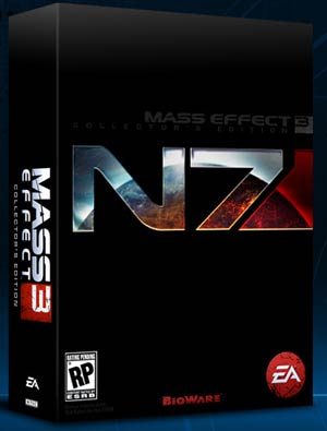
I'm not really sold on the generic cover. It's better than ME2 (what were they thinking?), but the CE is beyond awesome. Can't wait to have that sucker on my shelf!