My first piece of pixel art. What do you lot think?

Recommended Videos

KaosuHamoni

New member
Apr 7, 2010
1,528
0
0


Just what it says on the tin. I used Photoshop and a Wacom tablet, and it was done for both an exhibition, and a college project.

It is based off oldschool Castlevania, and to an extent, Shovel Knight.

Criticisms welcome!
 

AlouetteSK

New member
Sep 4, 2014
47
0
0
Tombstones on the right seem parallel with the building. Think they need more contrast to show some sort of distance. Left tombstone overlaps building, so that's fine. Looks really good, though.
 

KyuubiNoKitsune-Hime

Lolita Style, The Best Style!
Jan 12, 2010
2,151
0
0
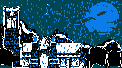
The tombstones in the foreground seem rather much larger than they should, some more foreground vegetation, contrast, and/or detail on the tombstones could fix that. The white parts of the image on the building could some more detail as well. Aside from those two criticisms this is a great image, some good digital art there. Another suggestion is that it would be a neat trick might be to animate the image some, have the grass sway and animate the rain fall. Though over all this is a very good piece of pixel art, looks straight out of an NES game. If you're going for game design this is a great start for pixel art for indie development.
 

Pseudonym

Regular Member
Legacy
Feb 26, 2014
802
8
13
Country
Nederland
I like it. It gets this feeling of a dark rainy night across quite well. I especially like the fading mountains in the background. That little detail makes it clear that the rain obfuscates your view in the distance.

There are three weird things that sort of take me out of what I am looking at though.

1. The two raindrops that seem to be a part of the church. What are they supposed to be? Part of the building? Was the building built rainthemed?
2. The door gets more narrow on its lower part. That seems rather difficult to build and very unpractical for those who want to use it.
3. The tombstones. Why are they in front of the building. Wouldn't you rather have them after the building or across the road. It looks like you have to go through a graveyard to get to the front door now.

These things look, at least to me, like they are there more because you thought it would add to the picture than because it makes sense for them to be there from the internal logic of the world your picture represents. You've worked with a minimalistic amount of colors and lines and that works. No need to add those extraneous details I think.
 

Armadox

Mandatory Madness!
Aug 31, 2010
1,120
0
0
Color contrast. Minor bit of dull yellow and red can help to break up your smallest, closest details, and help to draw the eye to the parts of the picture you want them to observe. A sliver of yellow in the moon, some red or green in the windows, or a small grey bar on the side of the tombstones could do a lot to help both add depth to your image and keep the focus away from parts of the image that has the least appeal( such as the mountains).
 

Batou667

New member
Oct 5, 2011
2,238
0
0
Hey, nice picture. It's very reminiscent of 80s games, particularly platforms like NES and the ZX Spectrum which tended to use a lot of black space.

It possibly breaks a couple of art conventions, like the foreground having less detail than the mid- and background. Also I think some kind of block shading on the castle may have been less "noisy" than the texture used. Still, very respectable and a decent homage to the style.
 

Johnny Novgorod

Bebop Man
Legacy
Feb 9, 2012
19,347
4,013
118
I like it, but the tombstones in the foreground and the mountains in the background shouldn't be the same kind of black.