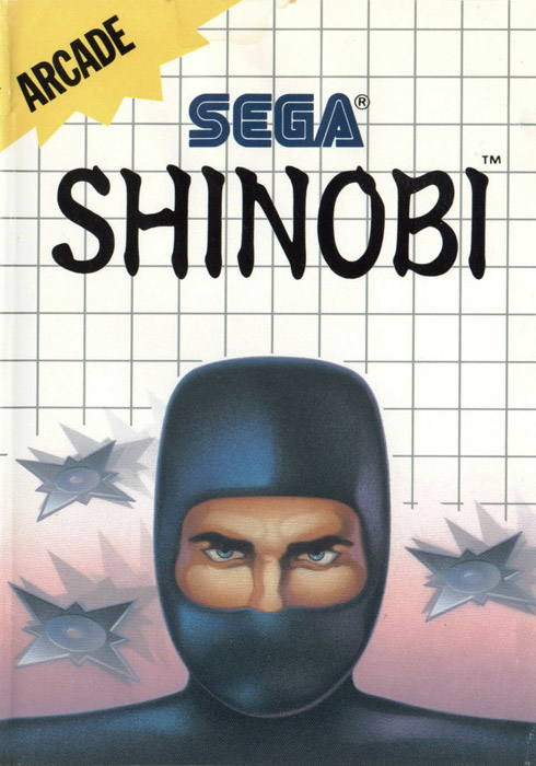
If the devs and publishers could refrain from crapping all of their own logos, age ratings, system logos and such on the front cover, that would immediately help their cause a great deal. I took a quick look at my movie DVD covers, and as a rule, they don't feature large movie company logos. Even when they do put a logo on the cover, they tend to use a small and simple version of it in one color only, carefully adapted to fit the cover so that it does not stand out or disturb the composition. (All halfway decent logos can be rendered in a simple fashion and still look good.) Age ratings and "DVD movie" logos likewise often go on the back and the spine, not the front. Everything is put to the service of making the whole look good.
The Gamecube, old XBox, XBox360, and Games for Windows "header elements" are so brash and strongly colored, and the PS3 "sidebar" text so strong, that I'm not sure whether it's even possible to make a truly great cover with those elements. The PS2 "banner", while highly visible, is relatively neutral and easy on the eye in comparison. The Wii corner logo is not bad, but I think it still intrudes on the cover art more due to its more complex shape, and strongly favors lightly colored covers.
Here's one of my favorite covers, Katamari Damacy on the PS2:
http://www.vgmuseum.com/scans/psx2/katamari_front.JPG
And Psychonauts on the PC (although it got plastered with extra logos, blech):
http://i28.photobucket.com/albums/c236/drjbobius/psychonauts.jpg
Something Awful goons came up with some alternate, "classy" covers here:
http://www.somethingawful.com/d/photoshop-phriday/classy-video-games2.php?page=1
Some of the fan covers on the thread are so good, I'd like to have stick them on my wall as posters. The ultimate is probably what they did with R-Type:
http://tinyurl.com/cxk2uc
So. Why don't we ever get subtle covers like that?


