Western games give you pretty much something for everyone. At the same time, that means most people want more of the same, which gives bigger exposure to the same tired examples most detractors like to use. But you have to be blind not to realize the full extent of the western gaming catalogue...

Diversity of Western Games (Looking past the Brown)
- Thread starter Soviet Heavy
- Start date
Recommended Videos
If they one day manage to produce a Samurai Pizza Cats-esque cartoon show featuring the universe of Ratchet & Clank, I could die a happy man.Soviet Heavy said:I remember seeing a Japanese promo picture for Ratchet somewhere, actually.

Interesting that they like it so much.
OT: Despite being a former king of the FPS I think Halo 3 is a good example of a colourful game. I remember replaying it after a long period of military shooters, and thinking how much I actually liked the setting. Apart from the plant-zombie stuff.
Also, Little Big Planet. I think it was the first game this generation that turned me giddy with joy when I first saw it.
Ah, thank you.Kotep said:Divinity II: DKS, a quite good but lesser-known RPG, Prince of Persia, the 2008 reboot, and Venetica, a kind of crappy RPG.piinyouri said:I'm very curious, which ones are the third, fourth and seventh pictures from?Kotep said:snip
I'll be looking into Divinity II.
Kotep, what's the name of the second game in your post please?Kotep said:


Seriously though, I don't think brown-and-bloom is all that egregious, especially now that it's becoming more and more discredited. Hell, even games born as the brownest of the bloomiest shooters (Resistance) are getting fairly colorful.
Looks like Hard Reset.theotakuoverlord said:Kotep, what's the name of the second game in your post please?
OP pretty much hit ze nail in on ze head in terms of what games I would've picked.
The main purveyors of the "all western games are brown" argument seem to be people who don't really play many western games, and only take a look at the top selling ones.
Yeah, it's actually really easy to find color in Western games. Hell even in the military FPS genre there's color to be found.
The main purveyors of the "all western games are brown" argument seem to be people who don't really play many western games, and only take a look at the top selling ones.
Yeah, it's actually really easy to find color in Western games. Hell even in the military FPS genre there's color to be found.
Oh hey, I like this thread. Wait a second...
EDIT: Lately, I've been digging the style of Diablo III actually. It has a pretty decent amount of environmental diversity between the four acts with a widely varied color palette, and spell/attack animations are fairly vibrant and satisfying to see.
Posted that the other day in a thread complaining about the visual aesthetics of First-Person shooters. Yeah, I don't really understand the "Brown Shooter" generalization.shrekfan246 said:SO BROWN AND GREY.
MY GOD, LOOK AT ALL THE BROWN!!!!
UGH, IT'S LIKE THEY DON'T USE ANY COLORS AT ALL, GUYS!!!!

NO COLOR HERE!
NOPE, NONE HERE EITHER GUYS!

MY GOD, WHEN ARE DEVELOPERS GOING TO START USING COLORS!?!?!?!
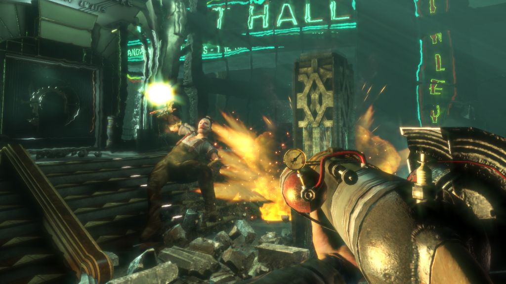

All I see is BROWN AND GREY, GUYS!!
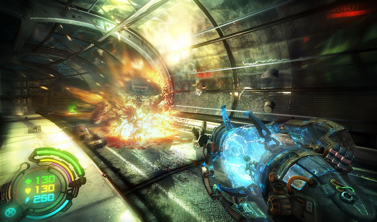


God. NO. COLORS. AT. ALL!!!!
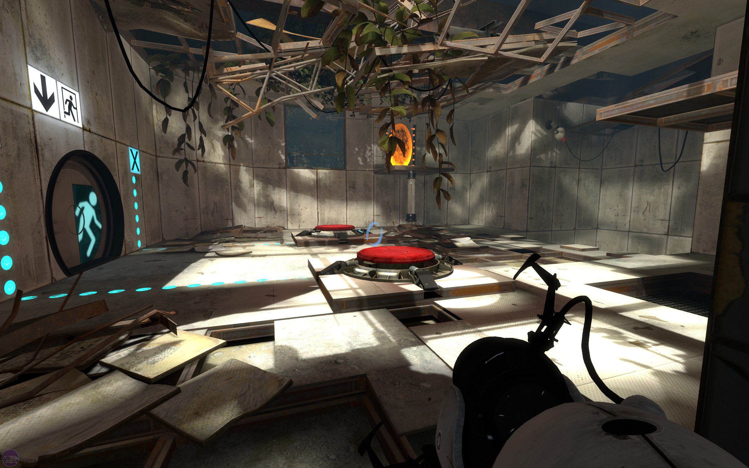

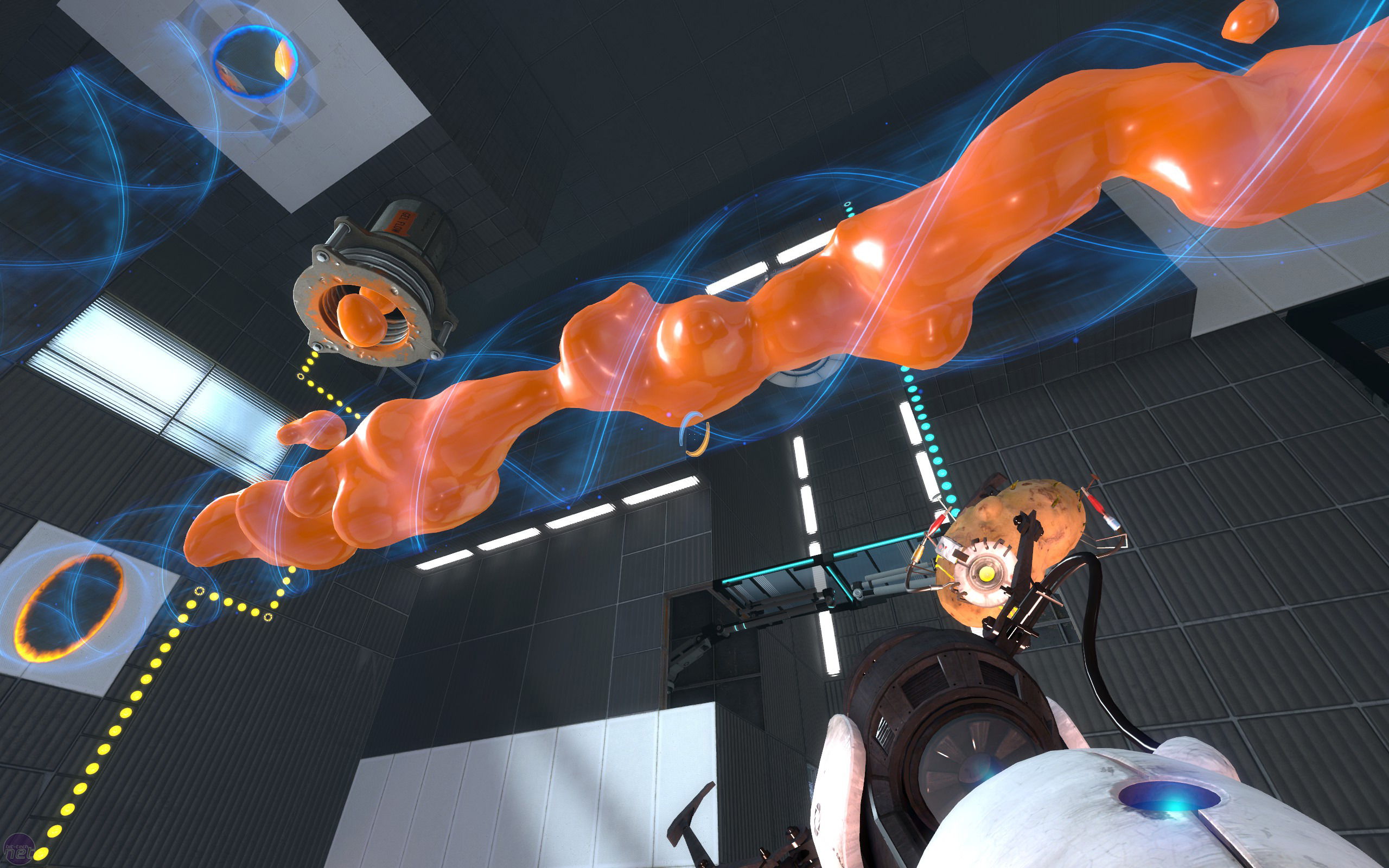
Man, it's like they use a MONOCHROME PALETTE!


Oh man, gold filter means it's ALL ONE COLOR!


Nope, ABSOLUTELY NO COLOR to be had here!
God save you if you open all of that up, you've been fairly warned.
Snipped irrelevant parts.
EDIT: Lately, I've been digging the style of Diablo III actually. It has a pretty decent amount of environmental diversity between the four acts with a widely varied color palette, and spell/attack animations are fairly vibrant and satisfying to see.
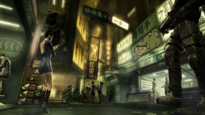
Wait, what? Borderlands? Vibrant palette?Soviet Heavy said:Bioshock, Crysis 2, Borderlands, FAR CRY. These all have very vibrant palettes......
OT: I think plenty of good examples have been given already.
Uh, yeah, it does.GethBall said:Wait, what? Borderlands? Vibrant palette?Soviet Heavy said:Bioshock, Crysis 2, Borderlands, FAR CRY. These all have very vibrant palettes......
OT: I think plenty of good examples have been given already.


And from the looks of things, Borderlands 2 will be even better as Pandora's summer season starts.

Forgive my ignorance, I just didn't get past all the generic brown urban environments from the first ten hours of the game.Soviet Heavy said:Uh, yeah, it does.GethBall said:Wait, what? Borderlands? Vibrant palette?Soviet Heavy said:Bioshock, Crysis 2, Borderlands, FAR CRY. These all have very vibrant palettes......
OT: I think plenty of good examples have been given already.
And from the looks of things, Borderlands 2 will be even better as Pandora's summer season starts.
The DLCs do help liven the place up. I find it funny, your response was pretty similar to the same people who I'm lambasting for declaring all stuff brown when there's a lot of color to be found even in the brownest of games. Not a slight against you, just an observation.GethBall said:Forgive my ignorance, I just didn't get past all the generic brown urban environments from the first ten hours of the game.Soviet Heavy said:Uh, yeah, it does.GethBall said:Wait, what? Borderlands? Vibrant palette?Soviet Heavy said:Bioshock, Crysis 2, Borderlands, FAR CRY. These all have very vibrant palettes......
OT: I think plenty of good examples have been given already.
And from the looks of things, Borderlands 2 will be even better as Pandora's summer season starts.
I don't think I'd buy DLC's for Borderlands although Borderlands 2 has caught my eye. I would have been able to tolerate the game more if the quests weren't so samey. And yes, alot of seemingly brown games have colour in them, somewhere.Soviet Heavy said:The DLCs do help liven the place up. I find it funny, your response was pretty similar to the same people who I'm lambasting for declaring all stuff brown when there's a lot of color to be found even in the brownest of games. Not a slight against you, just an observation.GethBall said:Forgive my ignorance, I just didn't get past all the generic brown urban environments from the first ten hours of the game.Soviet Heavy said:Uh, yeah, it does.GethBall said:Wait, what? Borderlands? Vibrant palette?Soviet Heavy said:Bioshock, Crysis 2, Borderlands, FAR CRY. These all have very vibrant palettes......
OT: I think plenty of good examples have been given already.
And from the looks of things, Borderlands 2 will be even better as Pandora's summer season starts.
It really just plays like an FPS Diablo game, but I do hope that Borderlands 2 ramps up the variety a bit.GethBall said:I don't think I'd buy DLC's for Borderlands although Borderlands 2 has caught my eye. I would have been able to tolerate the game more if the quests weren't so samey. And yes, alot of seemingly brown games have colour in them, somewhere.Soviet Heavy said:The DLCs do help liven the place up. I find it funny, your response was pretty similar to the same people who I'm lambasting for declaring all stuff brown when there's a lot of color to be found even in the brownest of games. Not a slight against you, just an observation.GethBall said:Forgive my ignorance, I just didn't get past all the generic brown urban environments from the first ten hours of the game.Soviet Heavy said:Uh, yeah, it does.GethBall said:Wait, what? Borderlands? Vibrant palette?Soviet Heavy said:Bioshock, Crysis 2, Borderlands, FAR CRY. These all have very vibrant palettes......
OT: I think plenty of good examples have been given already.
And from the looks of things, Borderlands 2 will be even better as Pandora's summer season starts.
The first page is like an acid trip of colour, probably shouldn't have unspoilered ALL the images.
@OP: There are a lot of GROSS generalisations out there. None of them can be taken for truth...
@OP: There are a lot of GROSS generalisations out there. None of them can be taken for truth...
I think sometimes brown can detrimental, it's the reason I don't play the map rust on MW2. Jesus, if your guy is brown and your weapon is brown, there is literally nothing there that's not brown. It's a bit weird.
Although, I find gears of war and farcry 2 quite fun, and while it is colourful sometimes, a lot of farcry 2 is very brown. Same with borderlands.
Although, I find gears of war and farcry 2 quite fun, and while it is colourful sometimes, a lot of farcry 2 is very brown. Same with borderlands.
*ahem* That game is British.Soviet Heavy said:How come the western games market doesn't make anything colorful, like Ratchet and Clank (oh wait), or Viva Pinata (oh wait), or Psychonauts (oh wait), or Sam and Max (OH WAIT)? It's all just macho shit with ugly art that all sucks and none of it appeals to me!
Anyway, how about some indie games? Steam is full of them, and GoG has a few of them, as well.
Speaking of which... PORTAL 2! We can also bring up stuff like Uncharted, inFAMOUS, [Prototype], VVVVVV, Super Meat Boy, and the recent Batman games. The American ratio isn't as heavy on first-person shooters as you think.
It's not about brown or gray or any specific color! (Well, Gears of War is a special case...)
It's about relative saturation. The less saturated your color palette, the more "realistic" it looks - giving the impression that it's all brown and gray even when the actual colors are of a range of hues and values.
Let's talk about this with examples.
* Deus Ex is a hue-restricted game. It's mostly yellow. This is a stylistic choice, and works well in context, but gets old after a while.
* Mirror's Edge did the same thing, but for individual areas. The end result is style and variety at the cost of internal dissonance between areas. Going from red to blue to yellow to orange can be jarring.
* Thief (3) has a good range of hues and saturations (mostly high saturation, though), but stays mostly in the lower end of the value spectrum. This plays to the game's setting and atmosphere.
* World of Warcraft is fully saturated, almost all the time. It also tends to stick to a single value region - bright or dark, no real in-between. Again, stylistic choice, but it doesn't work for some people (myself included)
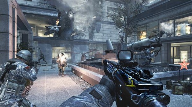
* CoD has low saturation throughout. Its greens are mostly gray-green; its reds dark or dull. It does OK on hue and value, though.
Real life, meanwhile, varies by time of day and location. Most places are vivid and bright at midday, but dark and dull at dawn and dusk - an effect games seem determined to ignore.
Point being, there's room for everything. 'Cept WoW clones. They can go shoot themselves.
/mytwentytwocents
It's about relative saturation. The less saturated your color palette, the more "realistic" it looks - giving the impression that it's all brown and gray even when the actual colors are of a range of hues and values.
Let's talk about this with examples.
* Deus Ex is a hue-restricted game. It's mostly yellow. This is a stylistic choice, and works well in context, but gets old after a while.
* Mirror's Edge did the same thing, but for individual areas. The end result is style and variety at the cost of internal dissonance between areas. Going from red to blue to yellow to orange can be jarring.
* Thief (3) has a good range of hues and saturations (mostly high saturation, though), but stays mostly in the lower end of the value spectrum. This plays to the game's setting and atmosphere.
* World of Warcraft is fully saturated, almost all the time. It also tends to stick to a single value region - bright or dark, no real in-between. Again, stylistic choice, but it doesn't work for some people (myself included)
* CoD has low saturation throughout. Its greens are mostly gray-green; its reds dark or dull. It does OK on hue and value, though.
Real life, meanwhile, varies by time of day and location. Most places are vivid and bright at midday, but dark and dull at dawn and dusk - an effect games seem determined to ignore.
Point being, there's room for everything. 'Cept WoW clones. They can go shoot themselves.
/mytwentytwocents
My current theory is that people that have a negative opinion of realist aesthetic in video games are in a general sense hung up about their childhood in some form or another, while the people who do favour more realistic fare are more likely to unhappy with the adult life they ended up with. It's all escapism but I reckon what you're using to make your escape stands a good chance of revealing just what you're escaping from.
"Western" refers to pretty much everything that isn't Japanese or Korean (which are the two main "eastern" video game nations).Lugbzurg said:*ahem* That game is British.Soviet Heavy said:How come the western games market doesn't make anything colorful, like Ratchet and Clank (oh wait), or Viva Pinata (oh wait), or Psychonauts (oh wait), or Sam and Max (OH WAIT)? It's all just macho shit with ugly art that all sucks and none of it appeals to me!
Western, meaning in broad terms anything not developed in Ukraine or Japan.Lugbzurg said:*ahem* That game is British.Soviet Heavy said:How come the western games market doesn't make anything colorful, like Ratchet and Clank (oh wait), or Viva Pinata (oh wait), or Psychonauts (oh wait), or Sam and Max (OH WAIT)? It's all just macho shit with ugly art that all sucks and none of it appeals to me!
Anyway, how about some indie games? Steam is full of them, and GoG has a few of them, as well.
Speaking of which... PORTAL 2! We can also bring up stuff like Uncharted, inFAMOUS, [Prototype], VVVVVV, Super Meat Boy, and the recent Batman games. The American ratio isn't as heavy on first-person shooters as you think.