That's... kind of the point. It's what charizard would have looked like if it was originally from the fourth Gen games and vice-versa.Eri said:Uh dude, what are you talking about? Garchomp isn't from gen 1, Charizard is. That's also not what a Charizard looks like.Some_weirdGuy said:I saw an image today however that finally hit the nail on the head:

Older pokemon designs were generally less 'complex', as in their designs tended to look more 'smooth', with less extra colours and less 'bits and pieces' (little added elements to their designs) than seems to be the norm among the newer generations.
S

New pokemon are different
- Thread starter Some_weirdGuy
- Start date
Recommended Videos
Well if that's what he -actually- meant, they should probably clarify because that sure isn't obvious, it makes it look like he's trying to argue a point with a picture that makes no sense.werewolfsfury said:That's... kind of the point. It's what charizard would have looked like if it was originally from the fourth Gen games and vice-versa.Eri said:Uh dude, what are you talking about? Garchomp isn't from gen 1, Charizard is. That's also not what a Charizard looks like.Some_weirdGuy said:I saw an image today however that finally hit the nail on the head:
Older pokemon designs were generally less 'complex', as in their designs tended to look more 'smooth', with less extra colours and less 'bits and pieces' (little added elements to their designs) than seems to be the norm among the newer generations.
S
2 pages worth of people who did understand it seem to indicate otherwise XDEri said:Well if that's what he -actually- meant, they should probably clarify because that sure isn't obvious, it makes it look like he's trying to argue a point with a picture that makes no sense.werewolfsfury said:That's... kind of the point. It's what charizard would have looked like if it was originally from the fourth Gen games and vice-versa.Eri said:Uh dude, what are you talking about? Garchomp isn't from gen 1, Charizard is. That's also not what a Charizard looks like.Some_weirdGuy said:I saw an image today however that finally hit the nail on the head:
Older pokemon designs were generally less 'complex', as in their designs tended to look more 'smooth', with less extra colours and less 'bits and pieces' (little added elements to their designs) than seems to be the norm among the newer generations.
S
But i'm not trying to argue anything, i was just sharing a revelation. Older designs were simplier/smoother featured, newer designs have added complexities, it's what i finally realised was the reason new pokemon and old pokemon 'feel' different. (and that picture helps to explain that point by swapping the styles around)
Actually, i wonder what it would be like if they re-designed all of the old pokemon using more of the style they now use. Or vice versa, do new pokemon in the simpler 'old' pokemon style. It would be an interesting thing to see.
Holy shit.Some_weirdGuy said:I saw an image today however that finally hit the nail on the head:
Older pokemon designs were generally less 'complex', as in their designs tended to look more 'smooth', with less extra colours and less 'bits and pieces' (little added elements to their designs) than seems to be the norm among the newer generations.
I have an idea.
Why don't we allow, for the next generation, players to customize their Pokemon's stripes/coloration (either for online, or for single-player, or for both), because while I would hate for most Pokemon to be modified, I totally love Charizard's here, and would especially love it if my design was unique from everyone else's.
Then you could just sit back and say "hey, look at these plain Pokemon without markings, check out how much cooler they look plain in Gen 1," or just "hey, these plain Pokemon look awesome, imma choose to leave mine plain."
Yes yes yes I loved that guy. I upped his Special Defense and Defense to max and gave him a shell bell. So any time he took damage it was only around one or two HP and every turn his shell Bell healed him a bit. So no one could do damage. It was sick. And during the Two on Two battles I paired him with Blaziken. Who had maxed Attack. It was nuts and I loved it.Sean Hollyman said:I'm more inclined to prefer the newer designs, I mean a lot of the old ones kind of suck.
A seal? Woah interesting.. a crab? Jeez, it blew me away.
I know it's not Gen V, but come on Gen III had an armored Tyrannousaurs.

That's the first time I've seen the Reshiram/Zekrom/Kyuurem thing all together.loa said:Ultimate badass legendary gen1 -> current gen
->
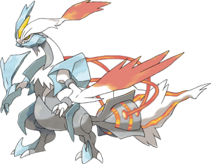
Yeahh...
You can argue that there were complicated designs in earlier gens and you would be right but there clearly is a trend to be seen here.
Some shapes are interesting but there's so much of those that now we're closing in on FF belts-n-zippers territory.
I'm curious how they can top THAT in the next generation.
Jesus Christ, that's bad. I assumed that combined they'd at least have the semblance of originally being ONE creature, but no. I've made better monsters out of goddamn Modulok.
How do I feel about the generation designs? Eh, they all have good and bad.
In no order in particular, for the good designs;
Mewtwo
Scizor
Glaceon
Mawile
Metagross
Scolipede
Hydreigon
Absol
Bad designs;
Mr Mime
Jynx
... and really, those are the only ones that leap to mind. I'm sure there are others.
I can agree that the Gen 1 Pokemon my not have been the most original and their design was pretty plain, but that's what makes them memorable in this day and age. To see where Pokemon began and how it has come in up to Gen 4 is really amazing. I am also not against slightly redesigning the older Gen Pokemon (that Charizard is awesome).
I don't mind too much for the new Pokemon, but I just hate the lack of imagination in creating them.
I don't mind too much for the new Pokemon, but I just hate the lack of imagination in creating them.
Gen 1 rocks because of Arcanine. Gen 1 sucks because of Jynx.
Gen 2 rocks because of Umbreon. Gen 2 sucks because of Magby.
Gen 3 rocks because of Blaziken. Gen 3 sucks because of Breloom.
Gen 4 rocks because of Luxray. Gen 4 sucks because of Kricketune.
Gen 5 rocks because of Haxorus. Gen 5 sucks because of Swoobat.
IMO.
Really the only problem I have with the each progressive generation is the insistence on Fire/Fighting for the starters. Neat the first time, lazy ever since.
You don't need to throw in 'my opinion'. Yes, there will be people insecure enough to take offence at what you think no matter how innocent, but forget 'em.Shanicus said:OH GOD, A POKEMON THREAD ABOUT WHICH GEN HAS BETTER DESIGN. FUUUUUUUUUUUUU -
Ok, should probably attempt to answer this thing seriously - and, well... I disagree. Yes, the modern pokemon are 'louder' in design, but that doesn't necessarily make them 'bad-looking'. Hell, I prefer the more complicated design over some of the simpler designs of the early generations - pokemon like Palkia, Golurk, Braviary, Groudon and Zekrom all look (again, in my opinion) much better than anything from Gen 1 and 2. The Complicated design also works in favor for many of the legendaries - Palkia, Dialga, Zekrom, etc. all covey a sense of power with their designs, while Gen 1/2 legendaries (Zapdos, Suicine, Raikou, etc.) don't give that same sense or power or legendary status due to their simpler design.
And yes, every generation has it's stupid designs - despite my love for muk, it looks kinda retarded and there is little positive feedback to give Mr.Mime. Dunsparce is silly, Glalie looks awful, Chingling is stupid (and rather useless) and Garbodor can die in a hole.
But I have to ask - why all the hate for this little guy?
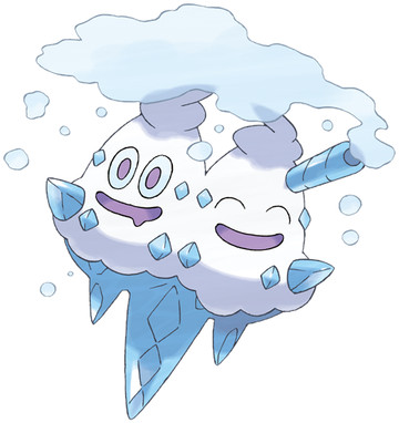
Mother-fucker looks down right tasty. Plus after Voltorb and Electrode, I don't think we have the right to complain about an Ice Cream pokemon hanging around.
Now, I reckon it's great you brought up the legendary's, that's what I liked most about the first 3 generations, it's those powerful designs that inspired me. You say it's the simpler design that doesn't make 'em out to be as strong while I reckon it's based more on how they're shaped that makes them look powerful.
Specifically by your examples -

Suicine is a crazy experiment but his figure is sturdy and he comes off as intelligent for a large dog that likes to dye his hair. Nothing on him sticks out so much.
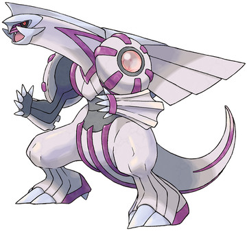
Now Palkia isn't bad but he does looks fairly goofy with everything stretched out on his large body including his small head. Also, the lines seem to be just there to fill in most of him, the legs I think need the same treatment.
My first impressions of him was that he is a space dinosaur with candy armour, the armour being a little over the top because dinosaurs are already intimidating.
As for Voltorb and Electrode, I do find them a bit too simple but they managed to give them the right face to give them attitude. The ice cream is just babyish (yes, there are many others and I don't like 'em either). The extra ice doesn't need to be there and I don't know any one who drinks their ice-cream with a straw. Once again over the top.
Once again, should we talk about something else to make you happy?Alakaizer said:I read the title of this thread, and all I can think of is Strong Bad saying "Everyone is different. No two people are not on fire."
Soulfoodman said:Gen 3 rocks because of Blaziken. Gen 3 sucks because of Breloom.
Soulfoodman said:Gen 3 sucks because of Breloom.
Soulfoodman said:sucks ... Breloom.

you, out of my thread, now.
Breloom and Shroomish are pretty much my favourite. Those spores were awesome and they were a great pokemon which filled the grass-slot in my party(usually used them as secondary with my starter, swampert). But it's ok cause you just got the names mixed around, we all know you actually meant to put breloom in that first slot and blaziken in that second slot.
")
Back to thread in general:
I actually don't get all the hate for that icecream. yeah it's an icecream, but... so? (does kinda look like it might fit as a digimon though, now that i look at that picture of it above XD)
Nope, not at all. It just seems too damned over-designed. Not as much as some other 'mons, but still. Those extra spikes, those silly colours, all there just to make him look extra cool. It makes him a lot less iconic and a lot more forgettable. Too many bells and whistles.Don Savik said:And lets be honest, that charizard picture is a lot better than generation 1....I mean....cmon now...
Of course, Gen 1 had his fair share of crappy designs as well. Voltorb is just lazy and Magnemite is just as stupid as that gear-based Pokemon.
Assuming he's meant to look powerful and intimidating. He ain't, and the anime and the way they appear in the game pretty much prove that. No, Suicine isn't intimidating, he's supposed to look ethereal. Not legendary as such, but mystical. A Pokemon one in a million people can catch a glimpse of on a misty night in the forest. And they captured that perfectly with that design.Shanicus said:Suicine doesn't really give me the 'Legendary' vibe;he does look intelligent and is a very elegant pokemon, but Legendary to me needs to feel powerful and intimidating, and Suicine doesn't really give me much of that. Palkia does look a bit sillier then others, but it does have the intimidating and powerful look to it that makes it feel more of a Legendary.
Palkia looks plain impractical. Can he even move his neck? See more than a tiny 30-ish degree cone in front of him? So damned silly.
Ok, you win. Pokemon threads usually spiral into choas.Shanicus said:It's a poke-thread - these have a nasty habit of descending into a passive-aggressive shit-storm due to people throwing around their opinions as the definitive one, so adding in 'In my opinion' tends to slow the shit-storm down just a little. Escapist poke-threads don't burn up so quickly though, so it's more a force of habit here then anywhere else.
Suicine doesn't really give me the 'Legendary' vibe;he does look intelligent and is a very elegant pokemon, but Legendary to me needs to feel powerful and intimidating, and Suicine doesn't really give me much of that. Palkia does look a bit sillier then others, but it does have the intimidating and powerful look to it that makes it feel more of a Legendary.
However, probably as a bit of a back-step on my behalf, I still reckon Mewtwo is one of the better designs for a Legendary - probably because his facial features and general stance show a sense of confidence and power, which gives him a pretty intimidating look despite his bright-ish colours and simple design.
And my point about the Ice Cream pokemon wasn't it's design (It is a very 'cutesy' looking pokemon due to the cheerful faces and the fact that it's an Ice Cream cone), but that people keep complaining about the fact that it is an Ice Cream, i.e. an inanimate object. Voltorb and Electrode were both animated Poke'balls, i.e. inanimate objects, which makes complaints about having an Ice Cream for a pokemon a little... hollow. Magnamite/Magneton would probably have been a better example, but I like Magneton over Electrode, so I went with a personal choice.
Also, I believe that is a flake, not a straw. Still doesn't help Vanniluxe's design, but... all well, not much one can do about that.
I think I see what you mean, Palkia does look like an unmovable object. The picture I found even makes him look like he's saying "come at me bro".
What I see when I look at Suicine is that it is very strange. None of him makes sense and I get the power from the thought that he could be capable of any thing, like a spirit that could just pull a god move in an instance. Something that's best not to under-estimate.
Also, I love Mewtwo too. He's another strange one like Suicine. Mewtwo looks like he's made out of rubber but he also looks dominant. I hardly get that feel with any of the new pokemon. Another one I really like is Zapdos because his face and overall design looks so bloody aggresive, one of the few I rather not go near.
I agree with that many people that complain about the inanimate objects contradict themselves. Too me, as long as they can do it well, I don't give a damn where they get their inspiration. In fact, someone in this thread brought up an interesting story of how those pokemon came to be and I reckon it's pretty clever.
And that really does look like a straw ventilating steam.
I don't prefer any generation over the others, but I will say that Black and White are the best Pokemon games yet. At least for me, the game's mechanics are more important than the appearances.
Either way B/W has plenty of awesome Pokemon in it like: Haxorus, Hydreigon, Archeops, Golurk, and Braviary. Those are just off the top of my head. They are a tyrannosaurus with ax tusks, a flying hydra, an Archeopteryx, a golem, and an eagle.
Either way B/W has plenty of awesome Pokemon in it like: Haxorus, Hydreigon, Archeops, Golurk, and Braviary. Those are just off the top of my head. They are a tyrannosaurus with ax tusks, a flying hydra, an Archeopteryx, a golem, and an eagle.
Wait... people don't like voltorb? It's angry and it disguises as a pokeball. Clean, simple design. Also, candle ghost is great, no idea what ppl are on about. If I ran into one of those as a kid I'd totally put it on my team.