As a graphic designer, I'm not a fan.
That's not to say it's a bad typeface. In comparison to elegant typefaces like Garamond or Bodoni or refined, utilitarian modernist typefaces such as Univers or the much loved (and overused) Helvetica, it appears ugly, misshapen and childish.
The problem is the same with pretty much any typeface - Incorrect usage. Slapping Comic Sans on things is a very common thing, as it's a non-threatening and "funny" type, but it just doesn't work.
There's a rumour in the design world that it was designed to be easier to read for dyslexics (which graphic designers oddly tend to be), but whether that's true is anyone's guess.
So, no - I don't hate it. I don't like it, but I can see it's purpose. What I DO hate however, is bad typography and misuse of typefaces.
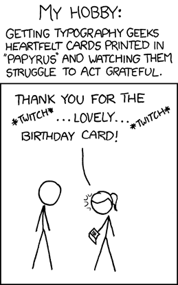
Now, a typeface that TRULY deserves hatred and should NEVER, EVER be used is Papyrus. Fuck that.
")
My top 5 typefaces are (in no particular order)
-Univers (especially the condensed numbers, upper 30s to 40s)
-Bodoni
-Steelfish
-Eurostile
-Trajan Pro (anyone who thinks Helvetica/Akzidenz is ubiquitous should look up this, it is EVERYWHERE)
I have a soft spot for Garamond and Century Gothic too, but they're a bit clumsy when it comes to elegant type design (for the most part, anyway).
That's not to say it's a bad typeface. In comparison to elegant typefaces like Garamond or Bodoni or refined, utilitarian modernist typefaces such as Univers or the much loved (and overused) Helvetica, it appears ugly, misshapen and childish.
The problem is the same with pretty much any typeface - Incorrect usage. Slapping Comic Sans on things is a very common thing, as it's a non-threatening and "funny" type, but it just doesn't work.
There's a rumour in the design world that it was designed to be easier to read for dyslexics (which graphic designers oddly tend to be), but whether that's true is anyone's guess.
So, no - I don't hate it. I don't like it, but I can see it's purpose. What I DO hate however, is bad typography and misuse of typefaces.
Now, a typeface that TRULY deserves hatred and should NEVER, EVER be used is Papyrus. Fuck that.
The correct term is geometric sans-serif. May help if you're ever looking for more.s69-5 said:My fave fonts are Century Gothic/ Avalon/ Avant Garde (all similar - but I do love round sans-serif). I don't mind Bank Gothic for some specific things.
My top 5 typefaces are (in no particular order)
-Univers (especially the condensed numbers, upper 30s to 40s)
-Bodoni
-Steelfish
-Eurostile
-Trajan Pro (anyone who thinks Helvetica/Akzidenz is ubiquitous should look up this, it is EVERYWHERE)
I have a soft spot for Garamond and Century Gothic too, but they're a bit clumsy when it comes to elegant type design (for the most part, anyway).