Your favorite kind of graphics.

Recommended Videos

Julianking93

New member
May 16, 2009
14,715
0
0
Heart of Darkness said:
Julianking93 said:
Heart of Darkness said:
I also like what Rare did with the Donkey Kong Country games, and use 3D models to create 2D sprites:
Oh, how could I forget DKC2??

That was my favorite game as a little kid. Such beautiful colors...I liek teh pweety colurs!
Colors? DKC2 was very muted when it came to colors. DKC3's were more satruated, and hence much brighter (and "pretty"), and they were also more varied.
Muted? Wha?

One of my favorite things about DKC2 was its use of colors in the levels.

I didn't really like 3's highly saturated and bright levels because for one, it kinda hurt my eyes and 2, I just far prefered the look of 2.

Maybe it was far less saturated, but muted? No.

Just look at the Bramble Blast levels.

That's pretty colorful to me.
 

Sampsa

New member
May 8, 2008
431
0
0
I find that Red Orchestra has nices graphics. http://i44.tinypic.com/eg1pwn.jpg

The game is not out yet, but who cares.
 

Dapper Ninja

New member
Aug 13, 2008
778
0
0
omega 616 said:
L1250 said:
Woah, hang on a sec. Your pictures aren't exactly a rainbow of colour, orange and green are the only ones that are different.

On topic. the realer (thats a word! according to my computer anyway) the better. I just don't like games that pour everything into graphics and tack on a story and gameplay as an after thought.
Okay, the second picture is, admittedly, not that colorful, at least by Okami's standards, but if you really need some more color,
Also, still images don't really do Okami justice. It's best to see it in motion. For example, the aforementioned not-exactly-a-rainbow-of-color image:
 

Heart of Darkness

The final days of His Trolliness
Jul 1, 2009
9,745
0
0
Julianking93 said:
Heart of Darkness said:
Julianking93 said:
Heart of Darkness said:
I also like what Rare did with the Donkey Kong Country games, and use 3D models to create 2D sprites:
Oh, how could I forget DKC2??

That was my favorite game as a little kid. Such beautiful colors...I liek teh pweety colurs!
Colors? DKC2 was very muted when it came to colors. DKC3's were more satruated, and hence much brighter (and "pretty"), and they were also more varied.
Muted? Wha?

One of my favorite things about DKC2 was its use of colors in the levels.

I didn't really like 3's highly saturated and bright levels because for one, it kinda hurt my eyes and 2, I just far prefered the look of 2.

Maybe it was far less saturated, but muted? No.

Just look at the Bramble Blast levels.

That's pretty colorful to me.
Don't get me wrong, I like DKC2, but "colorful" isn't an adjective I'd use to describe it. Bramble Blast is more of an exception than the rule, since it's a level that's not predominately either gray or brown. Even then, the level is still predominately green; it's not exactly as full of colors as some of the levels in DKC3. Same thing with the Hive levels--they're all orange. Where is the intralevel color variance?

Besides, the whole color scheme of two of the areas--Krem Quay and Gloomy Gulch--used colors that were much darker than the rest of the game. Perhaps "muted" was the wrong word to use. The colors in the game are pretty dark, though.

Actually, on second thought, it's probably better to pretend I didn't say anything on the matter. DKC3 kinda suffers from the same thing. But I'm still holding that it was more colorful than DKC2.
 

Julianking93

New member
May 16, 2009
14,715
0
0
Heart of Darkness said:
Don't get me wrong, I like DKC2, but "colorful" isn't an adjective I'd use to describe it. Bramble Blast is more of an exception than the rule, since it's a level that's not predominately either gray or brown. Even then, the level is still predominately green; it's not exactly as full of colors as some of the levels in DKC3. Same thing with the Hive levels--they're all orange. Where is the intralevel color variance?

Besides, the whole color scheme of two of the areas--Krem Quay and Gloomy Gulch--used colors that were much darker than the rest of the game. Perhaps "muted" was the wrong word to use. The colors in the game are pretty dark, though.

Actually, on second thought, it's probably better to pretend I didn't say anything on the matter. DKC3 kinda suffers from the same thing. But I'm still holding that it was more colorful than DKC2.
Yes, levels were predominately one color, but they were good colors. The use of the colors themselves were pretty progressive for the time and even if many levels consisted of one color scheme, they were nice to look at and done well.

Muted isn't the word I'd use. Darker, yes. Many of the middle levels were far darker than other games at the time, but they were still used well and there was more than just one set of bright colors like every other game at the time.

Perhaps I'm wrong on my part. Colorful may not be the best way to describe it, but the use of colors was well done.

The problem I had with 3 was that it was just too bright and looked similar to other games at the time. 2 didn't had more of an original feel to me and that's probably why I preferred it more. And I just loved Diddy. Kiddy got on my fucking nerves.

I guess the term "colorful" could go a bit better with a game like ALTTP since most areas consisted of a pretty broad spectrum of color.
 

Enigma6667

New member
Apr 3, 2010
766
0
0
The cel-shading of Borderlands...


The gritty high-amount of detail in Gears of War 2


The perceptional quality of Mirror's Edge (As if you're looking through real human eyes...)


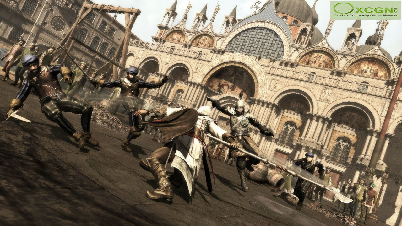
And the Assassin's Creed series...just the assassin's creed series...
 

Heart of Darkness

The final days of His Trolliness
Jul 1, 2009
9,745
0
0
Julianking93 said:
Heart of Darkness said:
Don't get me wrong, I like DKC2, but "colorful" isn't an adjective I'd use to describe it. Bramble Blast is more of an exception than the rule, since it's a level that's not predominately either gray or brown. Even then, the level is still predominately green; it's not exactly as full of colors as some of the levels in DKC3. Same thing with the Hive levels--they're all orange. Where is the intralevel color variance?

Besides, the whole color scheme of two of the areas--Krem Quay and Gloomy Gulch--used colors that were much darker than the rest of the game. Perhaps "muted" was the wrong word to use. The colors in the game are pretty dark, though.

Actually, on second thought, it's probably better to pretend I didn't say anything on the matter. DKC3 kinda suffers from the same thing. But I'm still holding that it was more colorful than DKC2.
Yes, levels were predominately one color, but they were good colors. The use of the colors themselves were pretty progressive for the time and even if many levels consisted of one color scheme, they were nice to look at and done well.

Muted isn't the word I'd use. Darker, yes. Many of the middle levels were far darker than other games at the time, but they were still used well and there was more than just one set of bright colors like every other game at the time.

Perhaps I'm wrong on my part. Colorful may not be the best way to describe it, but the use of colors was well done.

The problem I had with 3 was that it was just too bright and looked similar to other games at the time. 2 didn't had more of an original feel to me and that's probably why I preferred it more. And I just loved Diddy. Kiddy got on my fucking nerves.

I guess the term "colorful" could go a bit better with a game like ALTTP since most areas consisted of a pretty broad spectrum of color.
You keep using "other games at the time" to justify what you're trying to say. Care to give specific examples, or are you just going to go with that in the hopes that that's a strong enough argument?

And yes, I will agree that the colors were well-used. And I will agree that Kiddy can get annoying, but at the very least he offered more to the duo than Diddy did--Dixie can cover long distances, Diddy can...climb ropes faster. Kiddy can do the same, while also be used to smash weaker floors and propel Dixie to higher heights than what Diddy could do. Kiddy made the platforming more interesting.
 

Julianking93

New member
May 16, 2009
14,715
0
0
Heart of Darkness said:
You keep using "other games at the time" to justify what you're trying to say. Care to give specific examples, or are you just going to go with that in the hopes that that's a strong enough argument?
I'm just generally referring to the more...non colorful games of the SNES. There are far too many games for the SNES that I could choose from, but specifically, I'm referring to the rushed games such as say "Cliffhanger" "Bigfoot" or really any movie game to be published to make quick cash.

Hell, even the early SNES Castlevania games were devoid of any real color.

And yes, I will agree that the colors were well-used. And I will agree that Kiddy can get annoying, but at the very least he offered more to the duo than Diddy did--Dixie can cover long distances, Diddy can...climb ropes faster. Kiddy can do the same, while also be used to smash weaker floors and propel Dixie to higher heights than what Diddy could do. Kiddy made the platforming more interesting.
You could use Kiddy for that? Huh. I actually stopped playing around 15 minutes in because I just didn't like it nearly as much.

Yeah, Diddy didn't really do much in terms of strategic value like Dixie, but I just meant I liked him as a character. Plus, he did go faster and could jump higher just so ya know :D
 

Heart of Darkness

The final days of His Trolliness
Jul 1, 2009
9,745
0
0
Julianking93 said:
Heart of Darkness said:
You keep using "other games at the time" to justify what you're trying to say. Care to give specific examples, or are you just going to go with that in the hopes that that's a strong enough argument?
I'm just generally referring to the more...non colorful games of the SNES. There are far too many games for the SNES that I could choose from, but specifically, I'm referring to the rushed games such as say "Cliffhanger" "Bigfoot" or really any movie game to be published to make quick cash.

Hell, even the early SNES Castlevania games were devoid of any real color.
I hardly think using movie tie-ins is a good defense of that argument, since, in the immortal words of Strong Bad, "licensed games always suck." (Strong Bad's Cool Game for Awesome People: Episode 5: 8-Bit is Enough!) I also don't think using side scrolling beat-'em-ups and (whatever the hell Bigfoot is, since Google is only giving me results for an NES game) is a valid argument, either, since the feel between those games and 16-bit platformers are very different. What about other platformers from around the same time, or the ones that came before it? Like Super Metroid? How about Earthworm Jim (granted, I never really got past the second level)? What about Super Mario World 2: Yoshi's Island?

And yes, I will agree that the colors were well-used. And I will agree that Kiddy can get annoying, but at the very least he offered more to the duo than Diddy did--Dixie can cover long distances, Diddy can...climb ropes faster. Kiddy can do the same, while also be used to smash weaker floors and propel Dixie to higher heights than what Diddy could do. Kiddy made the platforming more interesting.
You could use Kiddy for that? Huh. I actually stopped playing around 15 minutes in because I just didn't like it nearly as much.

Yeah, Diddy didn't really do much in terms of strategic value like Dixie, but I just meant I liked him as a character. Plus, he did go faster and could jump higher just so ya know :D
And, again, that's why I like DKC3's platofrming better than DKC2's platforming. Moving faster isn't necessarily a big advantage since your not timed and few obstacles and levels actually require it (as opposed to Dixie, who's abilities are basically necessary to 100% the game). Jumping higher is also rendered null due to the buddy toss. The only thing Diddy was really good for was using the Diddy barrels.
 

Julianking93

New member
May 16, 2009
14,715
0
0
Heart of Darkness said:
I hardly think using movie tie-ins is a good defense of that argument, since, in the immortal words of Strong Bad, "licensed games always suck." (Strong Bad's Cool Game for Awesome People: Episode 5: 8-Bit is Enough!) I also don't think using side scrolling beat-'em-ups and (whatever the hell Bigfoot is, since Google is only giving me results for an NES game) is a valid argument, either, since the feel between those games and 16-bit platformers are very different. What about other platformers from around the same time, or the ones that came before it? Like Super Metroid? How about Earthworm Jim (granted, I never really got past the second level)? What about Super Mario World 2: Yoshi's Island?
First off, who the hell is Strong Bad? Second, I don't think that's necessarily true. What about the Super Star Wars games? I liked those a lot. Though I can only really think of that and the Batman Returns game for the SNES era of movie games that I actually liked.

I was actually going to use Mario as an example as I found it just bright saturated greens and blues with a bit of red thrown in, but then again, I've never liked Mario. At all, so I decided not to use it as I know I'd get some shit for saying "Mario isn't good or colorful" or whatever I'd say.

And I'm actually glad you said Earthworm Jim as that was one of my all time favorites and all in all, I'd say an almost near perfect game for its time. Don't hold that statement against me. Nostalgia may be playing a huge part of that.

Maybe using movie tie in games isn't a good point for an argument, but it's what I remember as a fairly often occurrence as a kid for SNES games to be pretty bland just considering there are so many of them.
And, again, that's why I like DKC3's platofrming better than DKC2's platforming. Moving faster isn't necessarily a big advantage since your not timed and few obstacles and levels actually require it (as opposed to Dixie, who's abilities are basically necessary to 100% the game). Jumping higher is also rendered null due to the buddy toss. The only thing Diddy was really good for was using the Diddy barrels.
Eh, true, but personally, I just couldn't get into 3 as much as I did with 2. Be it nostalgia, familiarity or just that I didn't like the style of it, I just didn't like it as much.
 

Heart of Darkness

The final days of His Trolliness
Jul 1, 2009
9,745
0
0
Julianking93 said:
Strong Bad is one of the characters from Homestar Runner [http://homestarrunner.com/], made into an icon due to his email segment. He also had a series of point-and-click games made about him for WiiWare and PC (by TellTale, I think). It was a quote from the fifth episode that lampshaded the fact that his game was, in fact, a licensed game.

And, actually, it is a valid point. While you are entitled to compare any game you wish to any other game, regardless of genre, it doesn't really hold up when talking about specifics. Granted, I might just be looking for evidence in terms of platformers, so it might just be me trying to say "what other platforms does it feel like," since, as I noted, 2D platformers have a much different feel than 2D beat-'em-ups or shooters. Compunded with the fact that the DKC games were made using 3D models posing as sprites and environments.

And I probably would've given you shit for saying that the Mario games aren't colorful. I mean, they are. Especially the remakes of the NES Mario games, that get rid of the blocky characters and/or increase the resolution to give softer edges, while simultaneous also increasing the color of the levels (again, by increasing the saturation, but whatevs). Super Mario World is the closest to being "saturated greens with blues and a bit of red thrown in," but the platforming elements (the '!' blocks, specifically) do give the levels are more colorful appearance. Not to mention the added color added in by the enemies. However, since you didn't want this to happen, ignore this paragraph.

Also, I'm a bit "meh" on Earthworm Jim. As I said, I never got past the second level, and I only got the game seven years ago when the guy I sat next to in science class found it in his sock drawer and offered to give it to me (since he got rid of his SNES). The controls are a little too awkward for my taste.

And, again, that's why I like DKC3's platofrming better than DKC2's platforming. Moving faster isn't necessarily a big advantage since your not timed and few obstacles and levels actually require it (as opposed to Dixie, who's abilities are basically necessary to 100% the game). Jumping higher is also rendered null due to the buddy toss. The only thing Diddy was really good for was using the Diddy barrels.
Eh, true, but personally, I just couldn't get into 3 as much as I did with 2. Be it nostalgia, familiarity or just that I didn't like the style of it, I just didn't like it as much.
I can accept that. DKC3 is still just as hard as its predecessor, though, if not harder. Most of the bosses are more puzzle-centric, and the Bonus World has Rocket Barrel Blast, which is probably one of the most frustrating levels ever.
 

Julianking93

New member
May 16, 2009
14,715
0
0
Heart of Darkness said:
This conversation seems to be heading down the road of just "my opinion over yours" so I think I'll stop here as we seem to be going round in circles.

We obviously have different perceptions of what constitutes as colorful and what doesnt and what is a good platformer and what isn't

Personally, I hated the entire Mario series and therefore, am not really going to agree that the platforming gave it a more colorful feel. Nor did I even remotely like DCK3 so I won't agree that it was really even that good.

Maybe it was that it was more difficult or that I just liked the style of 2 more, but I just didn't like 3.

Still, you bring up valid points about different games from the era and the comparing of 2D platformers and beat 'em ups, so yes, some things of that SNES time period were more colorful than others and many used the technology of the time brilliantly while others...not so much.
 

Heart of Darkness

The final days of His Trolliness
Jul 1, 2009
9,745
0
0
Julianking93 said:
Heart of Darkness said:
This conversation seems to be heading down the road of just "my opinion over yours" so I think I'll stop here as we seem to be going round in circles.

We obviously have different perceptions of what constitutes as colorful and what doesnt and what is a good platformer and what isn't

Personally, I hated the entire Mario series and therefore, am not really going to agree that the platforming gave it a more colorful feel. Nor did I even remotely like DCK3 so I won't agree that it was really even that good.

Maybe it was that it was more difficult or that I just liked the style of 2 more, but I just didn't like 3.

Still, you bring up valid points about different games from the era and the comparing of 2D platformers and beat 'em ups, so yes, some things of that SNES time period were more colorful than others and many used the technology of the time brilliantly while others...not so much.
True enough. That, and we shifted this from a discussion about graphics to a discussion about 16-bit platformers in general. Thread, meet derail.

Although do note, I never did say that Earthworm Jim was a bad game. I just said I didn't like the controls or how they handled. I'll be willing to give it another shot, though, if you give DKC3 another shot. The brightness of the colors kinda die out after Lake Orangutanga, and there's one area that's mostly dark gray, anyway. I'd say it'd fit within DKC2, but it's made out of metal, not wood. Nor is it pirate themed.
 

Julianking93

New member
May 16, 2009
14,715
0
0
Heart of Darkness said:
True enough. That, and we shifted this from a discussion about graphics to a discussion about 16-bit platformers in general. Thread, meet derail.

Although do note, I never did say that Earthworm Jim was a bad game. I just said I didn't like the controls or how they handled. I'll be willing to give it another shot, though, if you give DKC3 another shot. The brightness of the colors kinda die out after Lake Orangutanga, and there's one area that's mostly dark gray, anyway. I'd say it'd fit within DKC2, but it's made out of metal, not wood. Nor is it pirate themed.
Yes, this was a major thread derail.

But sure, I'll give DKC3 another shot. I will admit the controls of Earthworm Jim need a little getting used to and since after around the 3rd or 4th level, it becomes one of the most difficult games I've ever played. So you'll want to get used to those controls pretty quickly.

Also, the whole reason I didn't like 3 now that I think about it, was because it was a bit too reminiscent of the first DKC to me which I absolutely did not like.

I have an odd taste in games, I know.
 

reyttm4

New member
Mar 7, 2009
495
0
0
If you get me an indie game, where the graphics look like that new Escapist show Extra Credit, I'm bound to watch it.
 

Heart of Darkness

The final days of His Trolliness
Jul 1, 2009
9,745
0
0
Julianking93 said:
Heart of Darkness said:
True enough. That, and we shifted this from a discussion about graphics to a discussion about 16-bit platformers in general. Thread, meet derail.

Although do note, I never did say that Earthworm Jim was a bad game. I just said I didn't like the controls or how they handled. I'll be willing to give it another shot, though, if you give DKC3 another shot. The brightness of the colors kinda die out after Lake Orangutanga, and there's one area that's mostly dark gray, anyway. I'd say it'd fit within DKC2, but it's made out of metal, not wood. Nor is it pirate themed.
Yes, this was a major thread derail.

But sure, I'll give DKC3 another shot. I will admit the controls of Earthworm Jim need a little getting used to and since after around the 3rd or 4th level, it becomes one of the most difficult games I've ever played. So you'll want to get used to those controls pretty quickly.

Also, the whole reason I didn't like 3 now that I think about it, was because it was a bit too reminiscent of the first DKC to me which I absolutely did not like.

I have an odd taste in games, I know.
I actually didn't really play the first one until June (or whenever Cave Story was released for WiiWare). It's certainly...different, but I'm glad the second one took it in a better direction.

And it looks like I found something to do today. When I get off the computer, of course.